Introduction
In this tutorial, I’m going to walk you through the complete post-processing workflow I use in Lightroom Classic to transform a rather bland photograph into a rich, moody black and white image. It’s the same technique I apply to nearly all of my black and white photos, and it’s particularly effective when the original image feels flat or uninspiring.

Why Start by Destroying the Image?
It might sound counterintuitive, but I begin the process by intentionally reducing the exposure by four stops. In other words, I completely destroy the image—at least temporarily.
This technique serves a clear purpose:
- It gives me a clean slate to rebuild the image with the mood I want to create.
- It helps introduce a subtle ‘warmth’ to the black and white conversion, even though we’re removing color.
What You’ll Get From This Walkthrough
- A step-by-step look at how I approach black and white conversions in Lightroom Classic.
- Insights into how each adjustment contributes to the final moody look.
- An understanding of why starting from a “broken” image gives you more creative control.
I’ve also included a link to the original YouTube video, so you can watch the video of me post processing the image from scratch
I’ll be including screenshots from the video below, throughout this blog post so you can get an idea of what I do.
Alright, let’s dive in and start converting…
Table of Contents
Lens Corrections Panel
The first thing I do when starting any post-processing workflow on any image, is remove chromatic aberration created by the lens . It’s a mundane but necessary step.
Remove Chromatic Aberration
Now I’m ready to move on to the Basic panel and begin editing the image.

Change Adobe Color Profile To Adobe Monochrome
Switching the Profile
In the Basic panel, I switch the profile from Adobe Color to Adobe Monochrome, which will convert the image to black and white. I am not interested in any other black and white profile, artistic or otherwise. I’ll be making all my changes using masks and the adjustment panels.
Why Adobe Monochrome?
- It provides a clean, neutral starting point for black and white work, and that’s good enough for me.

Leave the Remaining Basic Adjustments Alone for Now
Why don’t I start playing with the Basic panel’s sliders once I’ve converted to Black and White?
At this stage, I want to avoid those global adjustments because:
- I want to use the Basics Panel later, to tweak the image towards the end of post processing. So I want to leave those sliders set to zero for now.
- Right now, I prefer to work locally, adjusting specific areas of the photo using masks to create selections.
And it’s in the Masking panel, where I’ll make targeted changes to different parts of the image.
Destroy Photo! – Linear Gradient
This is where the real transformation begins.
After converting the image to monochrome, I don’t dive straight into the global adjustments via the Basics Panel. Instead, I “destroy” the photo intentionally using a Linear Gradient. This may sound dramatic, but it’s a necessary technique that sets the foundation for more controlled local edits later.
Applying the Linear Gradient
I start by selecting the Linear Gradient tool in the Masking panel.
- Lightroom opens the gradient adjustment panel on the right.
- Then, I drag the gradient all the way down.
At this point, the entire image is selected by the gradient, which is visually confirmed by the red overlay (my mask color). This full selection allows me to make sweeping adjustments without affecting any of the global settings in the Basic panel.

Why Use a Linear Gradient to Affect the Whole Image?
- Like I said, I want to save the Basic panel for final global tweaks at the end of post processing.
- By applying a full-image linear gradient, I leave the Basics Panel alone
Making the “Destructive” Adjustments
Now, it’s time to temporarily – but deliberately – destroy the image!
First, I balance out shadows and highlights:
- I slide the Shadows slider to the right. This helps lift the dark areas and bring out shadow detail.
- Then I lower the Highlights by dragging the Highlights slider to the left. This softens the bright areas and brings out some detail in the brighter areas.
The result at this point is a much more evenly exposed photograph, with a softer contrast that reveals hidden detail.

Now, make the image almost pitch black:
I take the Exposure slider and drag it down — by a full four stops. This is the most drastic reduction you can make on a standard image in Lightroom.
Doing this plunges the image into darkness. But don’t worry — the idea here is to start from zero and re-expose the image, but only in the places I want.

Why This Works
Reducing the exposure across the entire image like this might look like you’re ruining the photo — but you’re not. That’s because I’m working with a RAW file, not a JPEG.
RAW files contain all the original image data captured by the camera, even in the darkest shadows and brightest highlights. This means you’re not actually deleting or damaging anything when you make extreme adjustments. You’re just choosing what to reveal or hide.
Even if parts of the photo look completely black or blown out, I can bring back detail at any time by adding another mask — for example, to lighten a dark area or recover a highlight. The full image data is always there, waiting to be used.
A quick caveat: I can only recover detail that actually exists in the RAW file. If a part of the photo was completely blown out (overexposed) when I took the shot, then no amount of editing will bring that detail back — because it was never captured in the first place.
That said, I only choose images to process where I know there’s enough information in the highlights and shadows, to work with, so this isn’t usually a problem.
RAW vs JPG: Why It Matters When Editing
A RAW file is an unprocessed data file straight from your camera’s sensor. It contains all the original data – every bit of light and detail the sensor captured. This gives you far more flexibility in editing. You can brighten shadows, recover highlights, and make big changes to exposure or white balance without damaging the image quality.
A JPG file, on the other hand, is what you get when your camera takes the original RAW data and applies a set of built-in edits. That would be things like contrast, saturation, and sharpening. And that would all be based on its default settings.
These edits are then permanently baked into the image, and all the extra data that wasn’t used gets thrown away.
To make the filesize even smaller (which is the whole point of JPG), the image is also compressed, which removes even more of the original image data. Because of this, you have much less control left in editing.
You can still make changes, but you’ll have far less flexibility, and trying to fix things like blown out highlights or deep shadows can damage the image visually, introducing what are known as artefacts or posterization.
In short:
- RAW gives you room to experiment, even “destroy” and rebuild parts of the image like I did with the exposure. Because the full data file is still there, underpinning the whole process.
- JPG locks in contrast, brightness and many other adjustments, as well as discarding most of the original picture data, limiting how much you can change later.
Re-Expose Photo – Radial Gradient
With the whole image darkened using a linear gradient in the previous step, it’s now time to bring back exposure selectively — reintroducing light in just the areas we want to draw attention to. This is where the radial gradient tool comes in.
Using a Radial Gradient to Reveal the Subject
To begin re-exposing the image:
- I created a new mask and selected the Radial Gradient tool.
- I hovered over the area where the subject of the photo is — in this case, the end of the road — and opened up the radial gradient wide.
- You’ll see in the screenshots that the selected area appears in red, indicating the area being adjusted.
- I used maximum feathering to ensure that the changes blend smoothly into the surrounding area, avoiding harsh transitions.


Then, I increased the exposure within that radial gradient. This helped to:
- Reintroduce light to just that area.
- Create a subtle three-dimensional effect, helping the viewer’s eye move naturally down the road and toward the subject.

Refining the Emphasis with a Second Radial Gradient
To add more of this effect and draw the eye in:

- I added a second radial gradient in the same general area, but smaller in size.
- Again, I increased the exposure slightly, just enough to emphasize the road a bit more.
- This stacking of gradients allows for a gradual build-up of light and tonal variation, rather than one flat adjustment.
At this stage, you can already feel the composition coming alive. The subject area is re-lit and takes center stage, without disturbing the rest of the image, which I can work on separately.
Final Tweaks for Balance
- Lightroom’s flexibility means you can always come back and tweak your masks. Nothing is set in stone.
Now I need to lighten the corners a bit. I need to recover detail in the shadows to ensure the entire image feels balanced.
Lighten Corners – Radial Gradient
With the subject of the image now clearly defined and lit, the next step is to recover shadow detail in the corners of the image. This helps prevent the corners from becoming too distracting. But I still want to maintain the moody feel that the Black and White conversion provides.
Why and how to Lighten the Corners?
Some areas of the image, especially in the corners, are still too dark and lacking detail. To fix this, I used several radial gradients – applied specifically to each corner – to selectively increase exposure and bring back enough detail in those corners so that they feel comfortable on the eye.
Step-by-Step: Applying Radial Gradients to the Corners
Here’s how I did it:
- I created a new radial gradient mask and placed the center of the gradient into the top left corner.
- I stretched the gradient out with 100% feathering, ensuring that the adjustment blended softly into the rest of the image.
- I increased the exposure slightly, just enough to reveal enough detail without brightening it too much.

I then repeated the process for the top right corner:
- Placed the radial gradient into the corner.
- Stretched it out with soft feathering.
- Increased exposure carefully to maintain the balance of light across the image.
And again, I did the same for the bottom right corner:
- Created a new radial mask.
- Dragged it across the area that needed lifting.
- Adjusted the exposure just enough to bring out details hidden in the shadows.
Notes on Precision and Timing
- At this point, I wasn’t trying to get everything perfect — some shadows still felt a bit crushed in parts of the image.
- That’s fine at this stage. I can always come back later and refine with a brush or tweak the gradients at any time.
- The important thing is not to overdo it. I wanted to maintain the mood and atmosphere, just lighten the corners enough so they don’t feel too ‘muddy’.
Previewing Further Adjustments
Once I was satisfied with these corner adjustments, I moved back to the Basics panel again to make broader tweaks, which will affect the whole image.
‘Soften’ Photo – Blacks Slider
With some of the shadow areas still feeling a bit too harsh, the next move in the post-processing workflow is to gently soften the overall image — without losing its moody character.
Why Soften the Image?
In black and white photography, deep blacks add contrast. But sometimes, those darkest areas can feel a bit too heavy or blocky, especially when you’re trying to maintain texture and detail across the frame.
This is where the Blacks slider in Lightroom Classic comes in.

Using the Blacks Slider to Soften the Shadows
To lift just a little shadow detail back into the image, I used this technique:
- I dragged the Black slider slightly to the right, which lifts the darkest tones and prevents the blacks from becoming too crushed.
- You can do this manually by:
- Hovering over the far left side of the histogram.
- Clicking and dragging to the right.
- Hovering over the far left side of the histogram.
- As I adjusted, I could see some of the lost detail starting to return in the deepest shadows.
This step helped reduce some of the intensity in the corners and softened the overall contrast just enough to preserve texture detail, without sacrificing the mood or atmosphere of the scene.
What’s Next?
This wasn’t a dramatic change — just a gentle nudge to create more balance before going into further refinements. From here, the next step was to continue adjusting within the Basics panel, seeing how the image responded to additional tweaks in contrast, highlights, and clarity.
Correct Image Exposure – BASICS PANEL
After softening the image slightly with the Black slider, the next step was to refine the overall exposure and contrast using Lightroom Classic’s Basic panel. This is where subtle adjustments can have a big impact on the final look and balance of your black and white image.
Fine-Tuning with the Basic Panel
This part of the process is all about bringing balance to the image — carefully nudging exposure, contrast, and tone to get everything sitting just right.
Everything is done by eye, and my advice is to go through each slider one by one just to see what happens.
Here’s what I adjusted:
- Exposure:
I added a slight increase in exposure — just enough to lift the image without compromising the overall mood. - Contrast:
I increased the contrast, but not too much. In black and white editing, too much contrast can quickly make areas look harsh or over-processed. The goal here was to enhance detail without going over the top. - Shadows:
Adjusting the shadow slider helped fine-tune some of the darker midtones and gently lift areas where detail was getting a bit lost. - White Slider:
I tested the white slider to see if it could give the image a nice visual pop. In many cases, this slider can brighten the highlights and bring a pleasant type of clarity to lighter areas.
However, in this particular image, the effect wasn’t significant — so I left it near its original position.

Evaluating the Results
At this stage, I was starting to feel happy with the overall tonal balance. The exposure feels right, I can see all the details without them distracting me, and the contrast wasn’t overpowering the moody feel.
Next, it was time to move on from the Basic panel and take a more detailed look at adjusting the tones with the Tone Curve.
Parametric Curve – TONE CURVE
After fine-tuning the exposure and contrast in the Basic panel, the next step was to dive into one of Lightroom Classic’s most powerful – and often overlooked – tools: the Parametric Curve within the Tone Curve panel.
Lightroom’s Secret Weapon: Parametric Curve
Many photographers seem to skip over the Parametric Curve, heading straight for the point curve instead. But I think that’s a mistake. The Parametric Curve is a fantastic way to bring extra pop and subtle contrast into your image — especially toward the end of your editing process.
- Independent Adjustments
The Parametric Curve operates independently of the Point Curve, and is a separate curve altogether. This gives you another layer of tonal control that adds to your existing adjustment layers. - Adds Final Polish
I often turn to it at the end of my workflow to inject a final bit of punch into the image — a small boost that can make a much bigger visual difference.
Making the Adjustments
Here’s how I approached the Parametric Curve in this edit:
- Highlights:
I started with the highlights and found that reducing them made the image too dull. So I pushed in the other direction until I found a sweet spot at around +11 — enough to give a nice little pop without blowing anything out. - Lights:
These sit just below the highlights and can really help refine the midtone contrast. I made minor adjustments here to maintain a bright but natural feel. - Darks:
Dropping the darks too far crushed the shadows and made the image lose its feeling of depth. So I brought them back up a touch to preserve details in the lower midtones. - Shadows:
These affect the very darkest tones. At first, lifting them gave a slightly faded, matte look — which can work in some edits but wasn’t right for this one. Pulling them down instead helped create a touch of contrast that gave the image a satisfying amount of visual ‘pop’.

Subtle Tweaks, Big Results
With these small tweaks, the image gained a subtle sense of depth and atmosphere, enhancing the moody black and white aesthetic I was aiming for. The Parametric Curve doesn’t need heavy adjustments to make an impact — just a few careful nudges can give your photo a noticeable edge. Just don’t ignore it.
Next, we’ll move into adjusting individual tones using the Point Curve for even more precision.
Point Curve – TONE CURVE
With the Parametric Curve adjustments in place, the next step was to make subtle refinements using the Point Curve.
Shaping the Look with Point Curve
The Point Curve allows for precise tonal control by letting you anchor and manipulate specific points along the curve. For this black and white edit, I used it to soften the overall contrast and give the image a slight fade look, adding an almost filmic characteristic.
Adjusting the Black and White Points
To achieve this, I made small changes to both ends of the tone curve:
- Black Point:
I lifted the black point slightly. This gives the shadows a more matte and gentle fade, remapping pure black to a very dark gray. - White Point:
I then dragged down the white point. Instead of having pure whites, the brightest areas were rendered as a very light gray. This dampens any harsh contrast. I find that softening the whites in this way adds a kind of ‘warmth’ to the image.

I always find that darkening the white point very, very slightly – turning pure white into a very light gray – takes the edge off and creates a more ‘cinematic’ atmosphere.
A Softer, Calmer Mood
These point curve changes may seem minor, but they have a big affect in shifting the tone of a photograph. Replacing absolute blacks and whites with ‘softer’ tones is how you create that faded look in images
At this stage, I was very happy with the photo. The contrast was now how I wanted it, and the overall image had that soft, rich tonality I’d imagined at the start of post processing it.
Sometimes, I choose an image that I think will suit a black and white conversion, but nothing clicks, and i end up giving up on that image. If that happens to you, don’t worry, it happens to everyone! Just choose another photo.
Anyway, next, I moved on to some selective adjustments using the Masking tool to further enhance key areas of the frame.
Interesting Brush Technique – MASKING TOOL
Once I finished the tone curve adjustments, I just needed some final finessing of the photo. I needed to dig out those stubborn darkest areas. And I did that by applying a mask, using the brush tool.
Creating the Brush Mask
I clicked the masking icon and navigated to the bottom left panel where all my masks are listed. From there, I created a new Brush mask.
Customizing the Brush Settings
To perform a very specific adjustment, I used the following technique:
- Exposure Increase: I loaded the brush with quite a strong exposure boost — +2.23 stops.
- Flow Setting: Then, I took the flow right down to about 10 – 13%.
This setting is crucial. Instead of dumping all that exposure change in one go, the brush now applies only a small portion of it with each stroke — about 13% of the total effect. This gives me incredibly fine-grained control over the adjustment.
By lowering the flow and using a strong exposure increase, I can “build up” the exposure increase gradually.

Brushing Light into the Shadows
With the brush configured, I painted over some of the darker areas of the image. These were places where shadows had been a little too crushed — areas that lost subtlety and detail after some of the earlier adjustments.
By applying multiple light strokes:
- I softened harsh shadows
- Recovered some texture and tone in the darker regions
- Avoided making the lighting look over-processed.
This technique allowed me to uncrush the shadows without affecting the overall look of the image.
Checking the Results
To evaluate the impact of the adjustment, I toggled the eye icon on Mask 7, which was the brush mask I had just applied. Even though the changes were subtle and localized, they made a noticeable difference in the overall balance of the image.
This is the power of working with reducing the flow value on brushes: you can make accurate, controlled changes that don’t go too far.
Next Steps: Local Adjustments
With that brushwork done, I felt there were still a couple of small local tweaks needed. Specifically, I wanted to draw attention to a certain area of the fence using a radial gradient — which is where we’ll head next.
Selectively Re-Expose Photo – RADIAL GRADIENT
At this stage of the post-processing, the image was nearly there — but I noticed a few areas that were still lacking depth and detail because they were too dark. This is where selective re-exposure using the Radial Gradient tool in Lightroom Classic came into play.
It’s a great way to guide the viewer’s eye and bring subtle light into important parts of the image.
Enhancing the Gate Area
One of the first spots I wanted to improve was the gate, which was looking a bit too flat and underexposed.
- I placed a radial gradient over the gate area.
- Gently increased the exposure to bring out some subtle detail.

The gate now had more texture and shape that it lacked before, without looking over-processed.
Sometimes, ta small lift in exposure can reveal detail and texture that adds depth to the image.
Guiding the Eye with Light
Next, I applied a similar adjustment to the road leading into the image:
- Applied a radial gradient over the front of the road.
- Increased the exposure slightly to make the path feel more visible and defined.

This helped the road lead the viewer’s eye into the photo more naturally, reinforcing the composition by drawing the eye into the photo more effectively.
Final Touches Using the Brush
After that, I used the brush tool again for some fine-tuning. I noticed something interesting while looking at the Navigator panel (that small thumbnail preview in the top left of the Develop module).
Even though the full-size image looked okay, the thumbnail revealed some overly dark areas — particularly in:
- The top left corner (tree area)
- The bottom left corner (foreground shadows)
- The bottom right of the frame
To correct this:
- I used the brush with a low flow setting (as before).
- Gently increased exposure in those areas.
- Made sure not to overdo it — just enough to reveal hidden detail and avoid harsh transitions. Keep everything nice and soft.
Evaluating the Mask
After applying these tweaks, I checked the Mask 10 toggle to see the difference. It was a subtle change, but an important one — it smoothed out some of the tonal imbalances and helped the image feel more cohesive.
These kinds of local adjustments are what bring a black and white photo to life. They don’t scream for attention but instead help everything feel more intentional and unified.
Final Tweaks – In The BASICS PANEL
With the image nearly complete, it was time for a few final refinements using the Basic Panel.
- I slightly increased the contrast to give the photo more depth.
- A tiny bump in exposure helped lift the midtones without losing that moody atmosphere.
- Finally, I dialed down the whites just a little to soften any remaining harsh edges.
At this stage, it’s not about dramatic changes — it’s about subtle, thoughtful decisions that pull everything together.
It’s also about knowing when to stop.
Because the urge now is to carry on making more and more and smaller and smaller changes. And we all need to be mindful of that psychological trap.

One Final Edit – MASKING PANEL
Despite the improvements so far, and despite what I just said above about over tweaking, I felt the gate area still needed just a touch more oomph! So I made one last adjustment using the Masking Panel.
- I added one more radial gradient, centered just in front of the gate.
- A small exposure lift brought out that final bit of detail, helping the gate sit more naturally within the frame.
This was the last step — the finishing touch that completed the black and white transformation. At some point you have to just walk away.
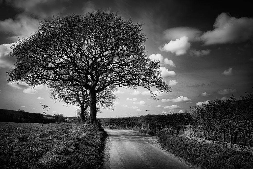
Before/After – FINAL IMAGE
Now just check the before and after versions.
- The original had a lot of uninspiring green – and none of that color was essential.
- In fact, removing the color helped focus attention on the shapes, textures, and structure of the scene.
- Now, what stands out are the trees, the fence, the road, and the overall mood of the shot


This final black and white version now has a visual impact in a way the original simply didn’t.
CONCLUSION – YOUR TURN TO EXPLORE
The exact process I’ve used here is how I approach most of my black and white conversions. It’s consistent, and built entirely within Lightroom Classic (no photoshop) using tools available to every photographer.
With this workflow, you can take images you might have once overlooked — photos sitting forgotten in your archive – and transform them into rich, moody, atmospheric black and whites. This method isn’t just about removing color; it’s about revealing emotion, form, and narrative that may have been ‘hiding’ all along.
You have to remember that a camera only records the number of photons that are hitting each photosite on the camera’s sensor. Whereas you are interacting with the environment, reacting emotionally, and capturing something that ultimately you are seeing with your mind’s eye. So your imagination is also heavily involved with every photo you take. Those two very different ways of ‘seeing’ have to be reconciled somehow. And that is what I use post processing for.
What to do next:
- Revisit your archives — especially those overcast or flat-light shots you never quite knew what to do with.
- Apply this process step-by-step, using the tools explored in this post.
- And most importantly, experiment — make the photo speak in black and white.
I’d love to hear from you:
What photo from your own archive are you thinking of converting to black and white after reading this?
Share your thoughts – or a link to your version – in the comments below. I read every one.