Introduction
Hello and welcome!
Let’s imagine you’re out taking photos, and suddenly you get a gut feeling — a spark of excitement that tells you there’s a photo somewhere in the scene in front of you.
That moment, that feeling, is what I call The Moment of Inspiration, and by now you should already know that!. I talked about it in detail in a previous post, and it’s the foundation for every photo that I ever take..
Once you’ve had that moment, it’s time to build your photo — to construct and compose it.


In the slides above, this is just a quick reminder of what the ‘Moment of Inspiration’ is. That intuitive moment that sparks the mechanical processes that this post will cover
If you’d rather watch than read, the full YouTube video is embedded at the bottom of this post – feel free to scroll down and hit play to watch.
This article and the video were made to compliment each other
Table of Contents
The Conventional Approach
At some point, most photographers are taught to:
- Use the Rule of Thirds grid
- Or, apply the Golden Ratio grid, or another compositional template
- Place intersection points over important elements in the scene
- Align the horizon with one of the grid’s horizontal lines
And…every now and then, using this method, you’ll take a really nice photograph.


you have a choice of templates, as seen on the left. And sometimes one of them works. But what happens when they don’t work. You only remember the successes
And because you score a direct hit every now and then, you assume that the rule is working. Not realising that all those misses could have been hits too, had you used a more flexible and creative system for composing photographs.

Applying compositional templates like the Rule of Thirds, or the Golden Ratio routinely and without thinking, will add to the number of ‘misses’, as has happened with these images.
But here’s the thing…
I’ve never once composed a photo this way. Not ever.
Okay, a few times, but only because having been told I was employing the rule of thirds (even though I wasn’t) I thought I’d see what all the fuss was about. Anyway, that was a long time ago!
But I rarely use it in anger, so to speak. I only employ it experimentally, or I just want to get some examples for an article, or for some tuition that I might be conducting in the real world..
A Different Way: Intuition Over Templates
Instead of using compositional grids (Rule of Thirds, Golden Ratio), I’ve always composed my photos using a purely instinctive and intuitive method, and then applying some mechanical processes . And because it’s rooted in intuition, it works almost every time.

To whet your appetite, the above slide shows an example of how I employ my more creative processes, that tune into my gut feeling and intuition. These processes allow me to get the composition right every time.
Once you combine this more natural approach with that initial moment of inspiration, your success rate — or “hit rate” — will rise dramatically.
Using these techniques will also free you up so that you will start to apply symmetry in photographs that work best with symmetry, often without even being conscious of the fact. The right decisions will eventually just happen.
What You’ll Learn
This method can actually be broken down into a series of mechanical techniques. And that’s what I’ll be summarizing in this article — techniques that form a complete, flexible system of composition.
Why These Techniques Work
The techniques you’re about to learn will also shed light on:
- Why the Rule of Thirds works when it works (Because mostly it doesn’t work!)
- Why the Golden Ratio works when it works (Ditto the above)
- Why templates like the Nautilus Shell sometimes seem effective
But the real benefit?
My mechanical techniques work all the time — as long as they’re combined with that initial, intuitive, moment of inspiration.
Placement
The first mechanical technique, in amongst all the intuition, is what I call placement.
What Is Placement?
Placement refers to the way objects are positioned at or near the edge of the frame. It’s one of the most important decisions you’ll make when composing an image, and it’s something that can be overlooked by photographers who rely solely on grids or templates.

Placement is all to do with placing large objects at the edge of the frame, allowing that object to leave the frame, but making it look like you meant for it to be there, so that nothing jars with the viewer. You must always be pushed into the photo, not pulled out.
Why Placement Matters
Sometimes, an object in your scene is so large that it must be inside the frame, but it also has to leave the frame. The key is to include enough of that object so that:
- It looks like it’s meant to be there
- It’s instantly recognizable to the viewer
Anything that is unrecognizable or ambiguous can feel ‘off’, and will likely jar with the viewer.
The Problem With Edges (Oh yes, those pesky edges!)
This principle doesn’t just apply to objects that leave the frame. It also applies to objects fully inside the frame but sitting very close to the edge. If something is placed too close to the edge, it can cause problems:
- It might distract the viewer’s eye from the main subject
- It creates curiosity about what’s outside the photo — and that pulls focus
- The image can lose its compositional strength and visual balance

Objects near the edge of the frame, must not have the effect of dragging the eye away from the subject.
In the worst cases, this curiosity can completely undermine an otherwise engaging photograph.


The first image is very jarring, as the boat is allowed to leave the frame, which drags the eye away from the subject, because we want to see the whole object. The second image is correct, and the whole object is in the frame, even though it is very close to the edge of the frame. It’s very simple and the rule of thirds would have negatively affected the composition had I applied it.
How Placement Helps
When used correctly, placement allows objects to leave the frame naturally, without distracting the viewer. And the secret is to…
Include just enough of the object in the frame so that it’s clear and recognizable.
That way, the object feels intentional, not accidental — It looks like you meant it to be there. And that will help your composition remain strong and engaging.
Separation
The second technique in this intuitive method of composition is separation.
What Is Separation?
Separation is about making sure that every object in your frame is given its own space. This isn’t just about occupying physical space — it’s also about instantly recognizing (as far as practically possible) what every object is.
When a viewer first sees your photo, every object should be:
- Clearly visible
- Easily recognizable
- Free from collision or overlap with other elements
By placing each object in its own distinct space, you allow the viewer to immediately understand what they’re looking at and how the elements relate to one another.

Every object needs to be instantly recognizable. That means positioning it in its own space, and allowing us to see the outline of the object.

This has clearly been achieved in this photograph
Why Separation Matters
If objects are too close together or overlap in distracting ways, it creates confusion. It becomes harder for the viewer to interpret the scene, which breaks their engagement with the photograph.
Separation brings clarity and order, and it’s often the difference between a cluttered image and one that feels clean and composed.
Interestingly, this concept is partly what the rule of thirds attempts to achieve — but it does so without considering the actual scene in front of you.
The rule of thirds dictates where objects should go, based on a preset grid, rather than responding to the specific conditions of your image. That approach:
- Undermines your intuitive moment
- Limits your creativity
- Can result in images that feel generic or less engaging
By contrast, separation as a technique lets the scene speak to you. It works in tune with your instinct and helps you maintain that personal and artistic touch.

All of the objects circled in these examples follow this very simple technique
Balance
The third essential technique in this approach is balance — and it’s absolutely vital for crafting a photograph that holds the viewer’s attention.
What Is Balance?
At its core, balance ensures that the viewer’s eye is drawn directly to the subject, without interference from other elements. A balanced photograph:
- Guides the eye smoothly
- Avoids any visual tension or confusion
- Feels harmonious and intentional

A balanced photograph is one where the eye is led straight to the subject upon viewing for the first time. From there, the eye can then explore the rest of the photograph.
How to Create Balance
There are two main ways to achieve balance in your photos:
1. Eliminate Distractions
- Remove or avoid including distracting objects in the frame
- Watch out for areas of pure black or pure white, which can pull attention away from the subject
- Consider the visual weight of every element — anything too dominant in the wrong place will disrupt the flow
Even small things can disrupt the eye’s path and cause the image to jar with the viewer.

This photograph is compositionally correct, and was guided by that moment of inspiration. but the camera has recorded light rather than seen an image. And so there is a lack of balance here due to the shadow areas and blown out highlights dragging away attention from the subject of the photo. Don’t worry, all will be revealed!
2. Rebalance Through Post-Processing
You can also create balance after the photo is taken:
- Darken bright areas that are taking attention away from the subject area
- Lighten shadowed areas that feel too heavy
- Aim for an evenness of exposure that helps the subject stand out without distractions
This subtle shaping of light and tone helps lead the eye exactly where you want it to go.

I have managed to darken the highlights, and bring out the detail in those dark shadows, which has allowed me to re-balance the image in Lightroom
Visual Weight and Composition
Balance also involves understanding how to distribute visual weight across your image. For example:
- A large dark tree on one side of the frame can be balanced by a bright sunlit field on the other, as long as there is something real or implied that leads the eye to it. If it looks right, it is right.
- A strong object near one edge might need a counterbalance near the opposite side
It’s not about symmetry — it’s about harmony.

Keeping objects evenly spaced and using them to provide a visual balance will help to engage the viewer
In the end, balance is about creating a photograph that feels satisfying to look at, where the viewer’s eye flows naturally to the subject and nothing gets in the way.
And let’s just say that thing again… if it looks right, then it is right! Can’t say that enough..
Example – Placement, Separation, and Balance in Action
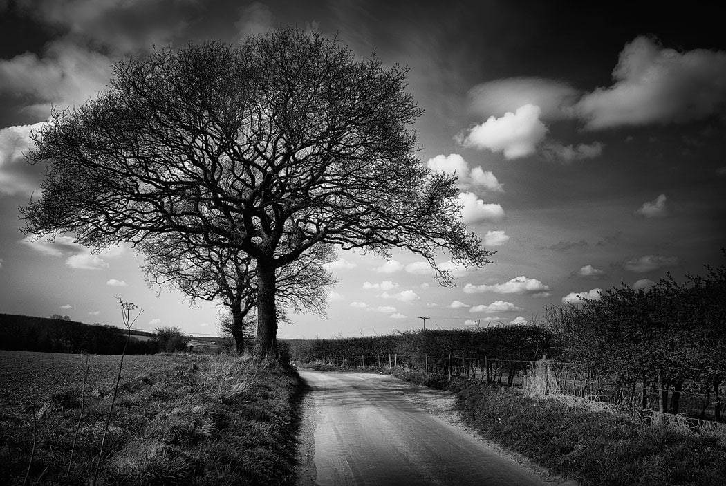
To bring all three techniques — placement, separation, and balance — together, let’s look at this real-world example that we had a brief look at above.

My camera recorded the colour version of this photo, but I saw in my minds eye, a version much closer to the black and white version. I used my standard composition techniques to compose the image, all starting from a moment of inspiration.
This photograph was taken along a quiet country lane in rural England. At the moment of inspiration, I had a mental image of what the final photo might look like — not necessarily in black and white, but with a strong tunnel-like effect and a distinct sense of depth and shape.
Pre-Visualizing the Final Image
When the moment of inspiration struck, the bright area in the distance was far less prominent than in the final image. But I already had a vision — an image more about graphic shapes than about color.
To stay true to that vision, I converted the photo to black and white, removing color as a possible distraction and allowing the shapes and tonal contrasts to speak more clearly.
Applying the Three Techniques
Here’s how each of the three techniques was used in this shot:
1. Separation

I divide the image into objects and make sure that they are all instantly recognizable, and sit in their own space. But always guided by the intuitive moment. Never lose sight of that.
- Every important object in the scene — trees, road, gate — is clearly defined and does not overlap confusingly with another.
- They each sit in their own space, and nothing is crammed or cluttered.
- I didn’t need to manipulate anything drastically — I simply recognized the moment and responded to it naturally.
- Notice how each object is separated from the edge of the frame. That space gives them breathing room and avoids creating tension that could pull the viewer’s attention outside the photo.
In this context, the edge of the frame becomes an object itself, something that needs to be respected and managed through careful separation technique.
2. Placement
- The road is a perfect example of intentional placement. It must leave the frame at some point — but how it does that, matters.
- There’s enough of the road visible to pull the viewer’s eye into the image, while still allowing it to leave the frame naturally. Too much or too little road could weaken its effect. Again, follow your instinct
- The gate, although not the subject, is part of the original moment of inspiration and is placed deliberately to support the scene.

The edge of the frame should be regarded as a object, and that will help you when deciding what must leave the frame at the edge of the frame. And in this case, that would be the road as well as the trees along the top edge of the frame.
3. Balance
- The area where the road and trees narrow into the distance is the compositional subject — the part of the photo where I the photographer, want the viewer’s eye to go.
- The other elements — road, trees, and gate — are balanced around that focal point to support it, not compete with it.
- Nothing in the frame pulls the eye away or jars with the rest of the image.
- These darker regions frame the photograph and create a visual push toward the center, helping the subject stand out and guiding the viewer’s eye.

What I call the ‘compositional subject’ is the subject of an image, regardless what a viewer in the future may think. And that helps to maintain discipline when composing. The arrow in this slide is pointing to what I have decided is the ‘compositional subject’
Trusting the Moment
This all happened whilst I was cycling along the road when this scene appeared in front of me as the road twisted and turned. And the moment of inspiration hit instantly. I didn’t overanalyze. I simply trusted my instincts, stopped, composed the image, and captured exactly what you see here. It took mere seconds.
And that’s what these techniques — placement, separation, and balance — are all about: recognizing the moment, trusting your eye, and crafting the composition with intention and clarity.
Balancing the Image in Post-Processing
While good composition should always start in-camera, post-processing is a powerful tool for fine-tuning balance and bringing your original vision to life.
Even when an image is compositionally sound — with thoughtful placement, clear separation, and good overall balance, at least to the naked eye when taking the photo – the way a camera sensor captures light can sometimes throw that balance off. This is where Lightroom (or any editing software) becomes essential.
The Role of Post-Processing in Balance
Once you’ve placed your objects, created separation, and ensured balance during capture, the editing stage helps reinforce the moment of inspiration that sparked the photo in the first place.
Here’s how it works in practice:
- Objects placed near or leaving the edge of the frame (such as the large trees in this example) guide the eye into the photo and help it flow naturally toward the subject.
- Framing elements like the edges of the road or lines formed by tree canopies push the viewer’s eye deeper into the scene — helping maintain flow and avoid distraction.
- Even subtle adjustments to light and color can dramatically affect visual balance.
What the Sensor Misses
The image may be compositionally correct straight out of the camera, but:
- The lighting captured by the sensor may not reflect what you saw or felt at the scene.
- In particular, tonal imbalances — Dark shadows and/or bright highlights — can disrupt the feeling or mood of the image.
- These deviations, disconnect the image from your moment of inspiration.
Restoring Balance in Lightroom
In the editing phase, you can correct those imbalances:
- Lighten or darken areas to lead the eye more effectively toward the subject.
- Adjust colors or remove them entirely (as in a black and white conversion) to strip away distractions.
- Even out exposure to prevent bright or dark spots from dragging attention away from the subject.
The goal is to make the final photo feel exactly how it did in your mind’s eye — to realign the image with the vision, emotion and clarity from that original inspired moment.
Intuition First, Technique Second
Once you’ve trained yourself to make these decisions through instinct — placement, separation, balance — the rest becomes almost automatic. Editing will become second nature; it simply being, the final step in bringing your vision to life.
The more you trust your intuitive moment, the quicker and more effective your decisions — both in the field and at your desk — will become.
The Three Core Techniques
Placement, Separation, and Balance — these three core techniques form the mechanical part of every photograph I take. They are not theoretical ideas I occasionally dip into; they are part of my instinctive process, present in every single image I publish.
Why These Techniques Matter
These three processes aren’t rules. They are creative tools that give you the freedom to:
- Place objects anywhere in the frame without relying on templates like the rule of thirds.
- Create engaging, original images that reflect your vision rather than someone else’s formula.
- Develop a photographic style that’s completely unique to you.
By learning, practicing, and refining these techniques, they’ll begin to feel natural — even subconscious. That’s when your compositions truly start to flow, and your creativity has maximum effect
From Technique to Style
When you apply Placement, Separation, and Balance consistently:
- Your images will start to feel more intentional and cohesive.
- You’ll no longer rely on external “rules” or overlays to guide your framing.
- Over time, your photographic style will emerge naturally — shaped by your instinct and intuition rather than templates.
These aren’t just tools for creating technically correct images. They are a way of guaranteeing your own originality.
My System vs. Compositional Templates
Placement, Separation, and Balance — while intuitive in origin — are also mechanical processes that support my gut response to a scene. They serve a similar role to compositional templates like the rule of thirds or dynamic symmetry grids. However, the comparison stops there.
The Difference: Flexibility vs. Rigidity
Let’s look at the key difference:
- Compositional templates (like the rule of thirds) are rigid. They impose fixed guidelines that tell you where objects should be placed — regardless of what’s actually in front of you.
- My system (Placement, Separation, and Balance) is fluid. It adapts to any scene and supports your natural response — the moment of inspiration — by giving it structure and clarity.
In other words, my approach is a flexible system that can handle any type of composition, in any situation. Templates, on the other hand, are hit-or-miss.
When Templates Fail
One of the biggest problems with compositional templates is this:
What do you do when they don’t work?
- What happens when the rule of thirds doesn’t suit the scene?
- How do you even know it’s not going to work in the first place?
- Some people say you just have to break the rules. But when?
I don’t have the answers to those questions — because I don’t use the rule of thirds. My system never needs me to ask those questions. I follow instinct, guided by Placement, Separation, and Balance, and I never need to cross my fingers that the scene in front of me “fits a grid.”
A Note on Some People’s Attachment to Templates
I get it — some photographers feel deeply connected to templates like the rule of thirds or dynamic symmetry. There can even be a kind of evangelism around them. And occasionally, yes, those systems will produce a stand out photo.
But the key word there is occasionally.
Wouldn’t you rather use a system that works every time — one that responds to you, rather than the other way around?
Give the Process a Try
If you’re feeling a little skeptical about the processes you’ve just learned, that’s totally understandable. But here’s a nice little challenge for you:
Open Your Mind — Just a Little
Why not open your mind just a teeny weeny bit and give this approach a go?
- Head out locally — a nearby park, a quiet street, your own neighborhood will do, just somewhere local.
- Wait patiently for a moment of inspiration to strike. Don’t force it.
- Trust your instincts when something catches your eye.
- Then, apply the techniques of Placement, Separation, and Balance to frame your photo.
You’ve Got Nothing to Lose and everything To Gain.
The best part? For this challenge, you don’t need to travel anywhere special. You don’t need perfect light or fancy gear. Just give it a go — see what happens.
And when you do, I’d love to hear how it went. Drop a comment and let me know how your experiment with this process turned out.
Start with the Most Important Rule in Photography
For the best results, it all starts with one thing: the moment of inspiration.
This is your gut feeling — that emotional pull telling you something is worth photographing. It’s what I consider to be the most important rule in photography.
If you’re curious to dive deeper into what that means, check out this blog post — it explains everything about this crucial first step.
Here is the YouTube video that goes along with this article.
Enjoying the video?
Check out more on my YouTube channel — I post regularly about photography, composition tips, post processing, and general photography goodness.
Conclusion
These three techniques – placement, separation, and balance – might sound simple, but when used in combination with your moment of inspiration, they can completely transform the way you compose a photograph.
They give you the freedom to move beyond grids and templates and instead create images that feel natural, and truly your own.
I hope this post has helped clarify how these ideas work together and why they’re so central to my approach to photography.
If you’ve tried any of these techniques in your own work – or if you have questions about how to apply them – I’d love to hear from you. Let me know in the comments how you get on, or share your own thoughts and experiences with composition.