Introduction
An Underrated Composition Tool
Hello everyone, and welcome back to a new post.
There’s one simple composition technique in photography that works almost every single time you press the shutter. And yet, despite its reliability and its visual power, it doesn’t get nearly enough attention or appreciation.
Some photographers dismiss it as:
- Too simple
- Too static
- Not the Rule of Thirds
But I believe they’re most definitely wrong—and I’ll show you why.
But isn’t symmetry dull and lacking imagination?
Take a look at the series of images below. Do you notice anything consistent in their composition? What are your first initial instincts telling you. Leave preconceptions behind!

I think this compositional type produces some truly great images. But it doesn’t get the attention that it deserves.
So what did your gut feeling or instinct tell you?
In this post, I’m going to show you why this under appreciated technique is actually one of the most powerful tools in photography. And if you manage to read right until the end, I’ll show you just how often it’s used by both professional photographers and talented amateurs. Possibly even without them realizing it.
About this Post
This blog post is adapted from one of my YouTube videos. I’ve written it so that it compliments the original YouTube video.
You’ll find the video at the bottom of this post!
Okay let’s get into it…
Table of Contents
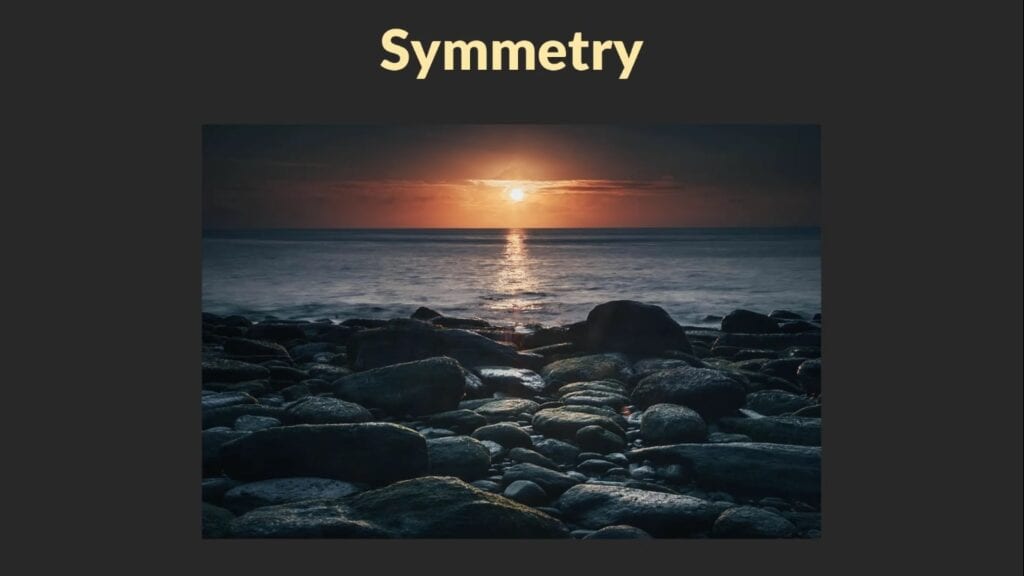
Symmetry vs Asymmetry in Composition
When it comes to photographic composition, there are two main approaches:
- Asymmetrical compositions – where each side of the frame is significantly different.
- Symmetrical compositions – where one side of the frame mirrors the other.

There are only 2 actual types of composition. Try and make full use of both of them.
I would go as far as to say that all photos can be categorised as one or the other.
Let’s take a closer look at both—because although they can produce images equally strong in impact, one of them often steals the spotlight over the other.
Asymmetry and the Rule of Thirds
Asymmetry is the mainstay of many photography teachers. It’s from asymmetry that we get the most famous composition guideline of all:
The Rule of Thirds
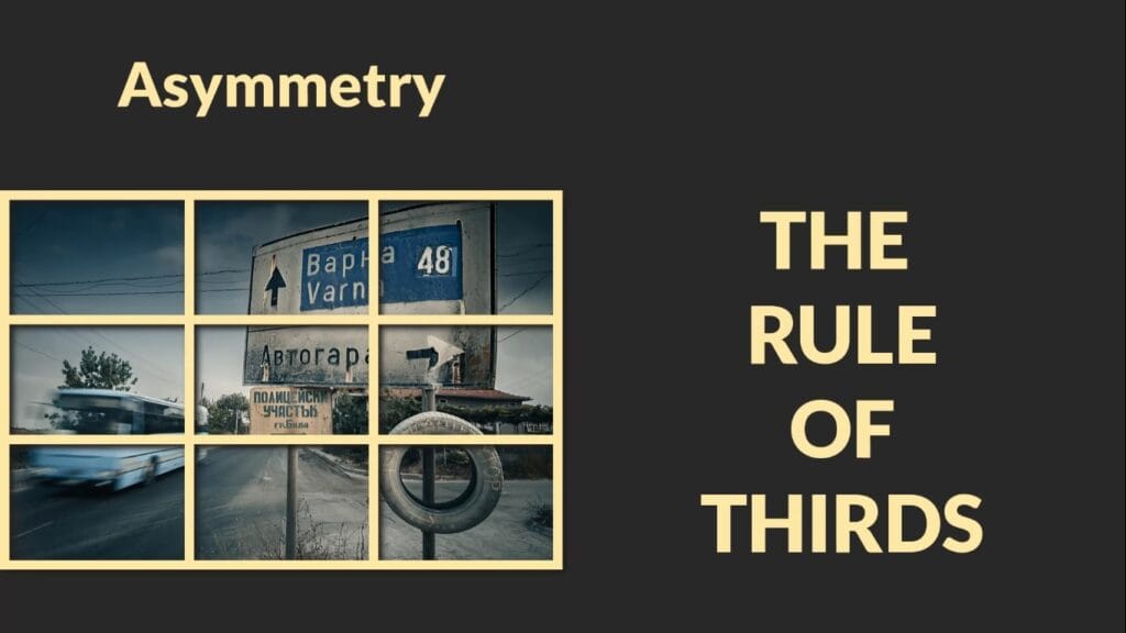
It is from asymmetry that we get the rule of thirds. And that seems to have grabbed most of the attention over the last 100 years or so!
So yes, that’s right, the Rule of Thirds is just ‘marketing speak’ to reel you in and think it’s something more special than it is. But in reality, it is just asymmetry. And it is asymmetry that is special.
But don’t worry—I’m not here to rehash the rule of thirds. That’s been done plenty of times before.
Instead, this article is all about giving some long-overdue love to that thing called symmetry. And before you yawn and go away, feeling slightly underwhelmed, I am going to fundamentally change the way that you think about symmetry…maybe!
Why Symmetry Deserves More Attention
Symmetrical compositions often get dismissed as being too simple or static or too obvious (unfortunately there is a lot of snobbery out there, as well as a lot of snake oil salesmen, just cutting and pasting wikipedia entries on th erule of thirds or dynamic symmetry).
But anyway, symmetrical compositions can be just as powerful, if not more so, than their asymmetrical counterparts. And yet, it’s the asymmetric compositions that tend to dominate the conversation.
Don’t dismiss symmetry.
So let’s shine the spotlight on symmetry for a change—and explore just how unique and brilliant it can be.
How to Recognize the Difference
Next time you’re in that picture-making moment, about to compose a shot, try asking yourself:
- Is this scene symmetrical or asymmetrical?
You need to know if you are inspired by symmetry or asymmetry. Go with your gut.
That one simple question might help you tune more deeply into what I like to call your moment of inspiration.
The Moment of Inspiration
The moment of inspiration is that little spark—when a scene opens up in front of you and you just know there’s a photograph hidden in there somewhere. It’s that feeling of excitement where you think:
“I bet that would make a good photo.”
But from that moment, you have a choice to make—whether you realize it or not.
Your composition will always end up falling into one of two main camps:
- Asymmetrical
- Symmetrical
And it really is as simple as that.
Why Symmetry Always Works
Symmetry always works. Every single time, and in a way that asymmetry doesn’t. Even if you are feeling completely uninspired, you can take a few symmetrical compositions that may trigger some more creativity.
There’s something a little strange about symmetry—or at least, I think so. And it’s this:
Symmetry always works.
No matter the subject, no matter the scene—if you apply symmetry along with just a little bit of discipline, the photograph will be compositionally correct. Every time.
It’s weird that something so simple, so straightforward, can consistently deliver strong results. And yet it does.
And you might think it’s weird that I think it’s weird – but it’s the reliability of symmetry that amazes me. It never doesn’t work. That makes it one of the most dependable tools in photography.
And because it always works, it deserves more attention than it gets.
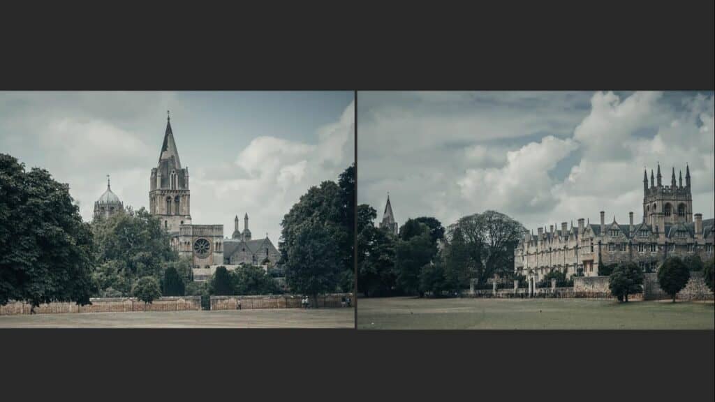
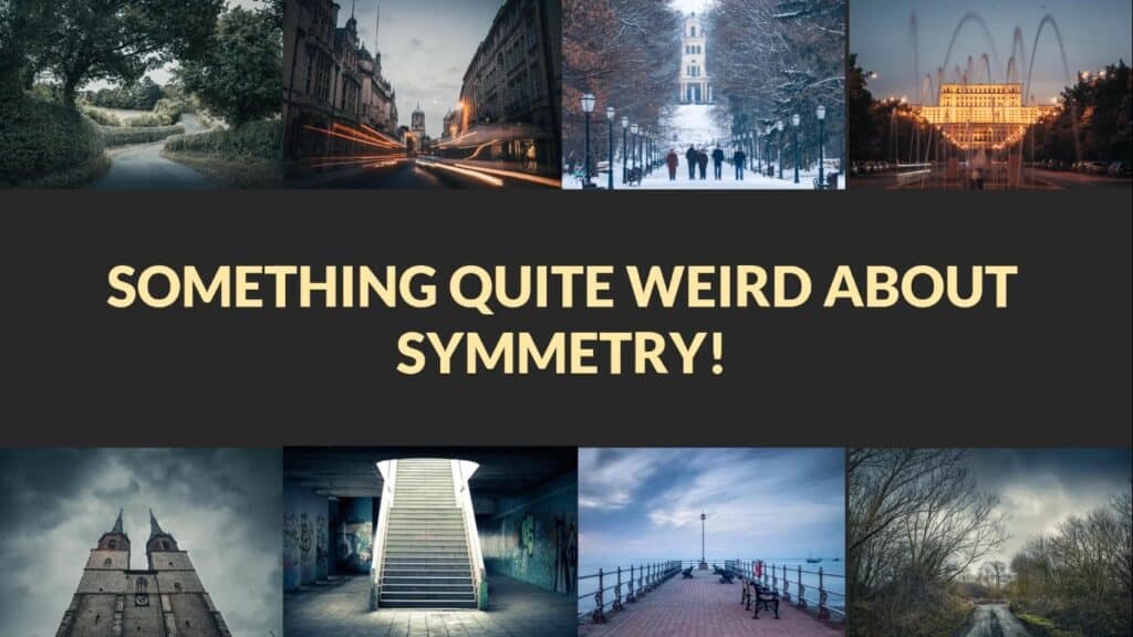
Case Study – Eight Symmetrical Photos
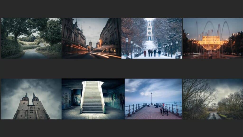
Each one of these photographs employs the exact same composition. One where the subject is placed in the middle with the left and right side being an approximate mirror image.
Let’s take a look at eight different photos. At first glance, they’re completely different:
- Different locations
- Different subjects
- Different lighting and weather
But every single one of them uses the exact same symmetrical composition.
Breaking Down the Composition
When I compose an image, I divide the scene into objects. Everything in the frame becomes an object:
- The sky
- Buildings
- Roads
- Trees
- People
- Mountains
Each object is either placed deliberately in the frame or left out altogether, based on what I feel in that moment—what I call the intuitive moment, rather than a mechanical or rule-based decision.
The Common Thread
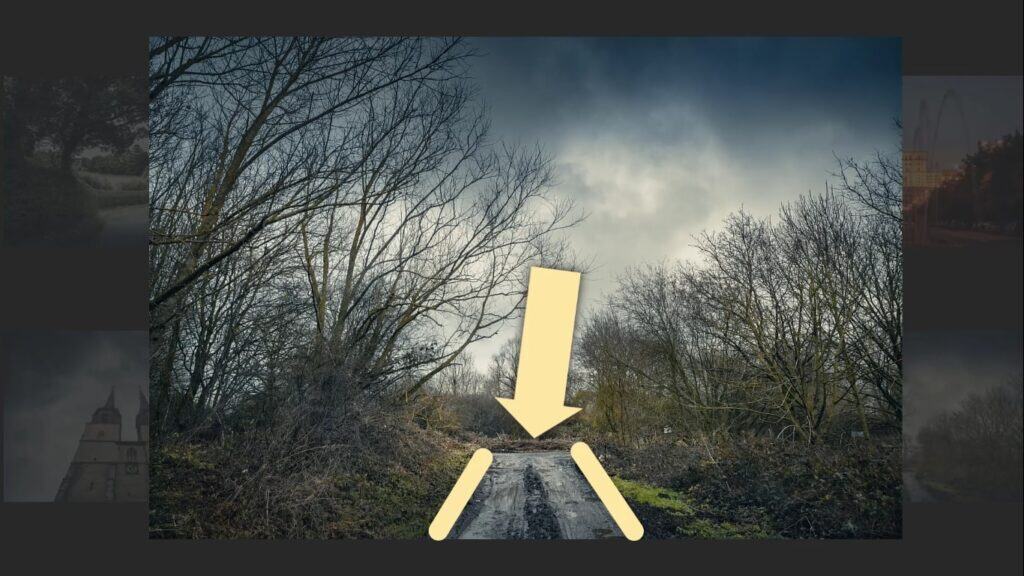
In all eight of these photos, the most important object is centered at the bottom of the frame, leading the viewer’s eye into the photo. Here’s how it plays out across the images:

Here they are again, but the subject circled. Check the list below.
- Top left: A road
- Next to that: Another road
- Next: A path with a man walking toward the camera
- Far right: A road cutting through the mountains toward a building
- Bottom right: A distant track
- Then: A jetty
- Next: A staircase
- Finally: A building
And all those objects perform the same visual function:
They start wide at the bottom of the frame and narrow as they move deeper into the image, drawing the viewer’s eye inward.
Each composition is a symmetrical layout using the same compositional structure, and yet they all feel unique and interesting. It’s proof that this kind of composition is not only visually powerful but also repeatable—over and over again.
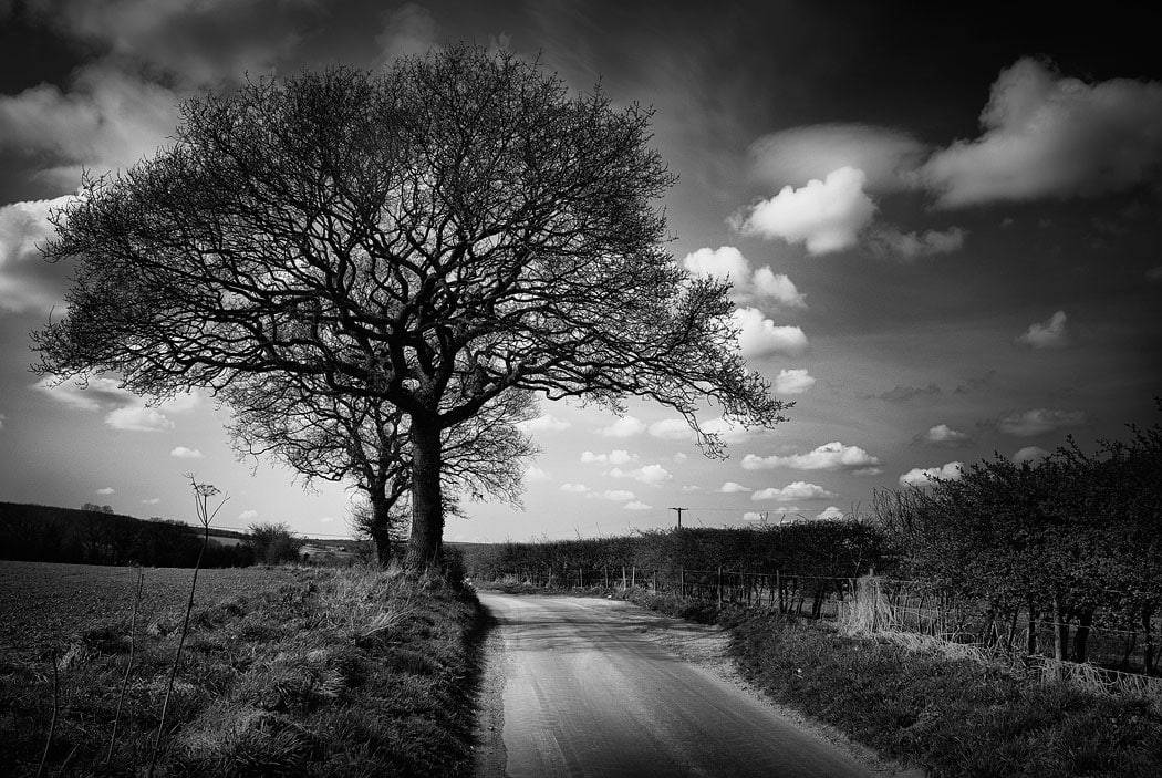
Symmetry with Trees – Different Formats, Same Principle
Now let’s move on to a new set of images. This time, the subject matter has changed—trees instead of roads or architecture—but the underlying principle is exactly the same:
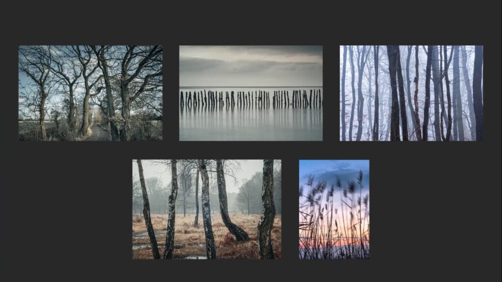
Symmetry, applied in a different format.
The trees in these images sweep across the frame from left to right. Some:
- Leave the frame at the bottom
- Leave the frame at the top
- Encroach slightly into the edges on either side
Except for the middle one, which breaks the pattern slightly, but the same symmetrical composition is at play. The layout still centers around symmetry and is therefore balanced – with equal visual weight on both sides of the frame.
Different Subject, Same Composition
Although the format and subject have changed, the core idea remains the same. We’re still using symmetry to build a visually satisfying composition.
And the great (and encouraging) thing is that this method works whether:
- You’re guided by an intuitive moment of inspiration, or
- You apply it more mechanically, meaning you are not necessarily inspired by an actual moment of inspiration, but are simply arranging objects evenly and deliberately.
Why It’s Weird That It Works
And so, even when you’re not feeling particularly creative, you can point your camera at a group of trees, get them looking nice and even, and you’ll end up with something visually pleasing.
Is it guaranteed to work every single time, if you are feeling completely uninspired? Probably not if you are just firing off completely randomly. But the odds are still solidly in your favor—well over 50%. And that’s why symmetry will always be weird and amazing to me: it works reliably well, even when you are completely uninspired.
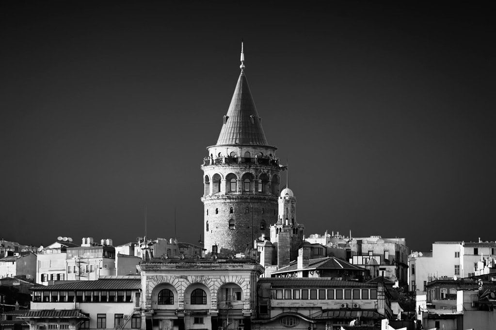
Centered Subjects – Symmetry and Simplicity
Let’s now look at one final group of images. Each one is composed with a single subject placed directly in the center of the frame. That’s it.

- A boat
- Another boat
- An island
- A sheep
- Another island
- The sun
Same Composition, Six Times
In every case, the subject is dead-center—nothing fancy. But the result is clean, impactful, and visually balanced.
This kind of composition is:
- Repeatable across locations and subject types
- Visually calming, thanks to the balanced frame
- Easy to execute, yet always effective
Inspired or Mechanical? Both Work.
Sometimes this setup emerges from an inspired moment—that moment of inspiration that tells you, this is the photo. Other times, you might be feeling uninspired, but you can just employ symmetry because you know it’ll work, and look good.
And that’s the great thing about symmetry—it offers both creative freedom and/or a reliable fallback.
Whether you’re led by your gut or just going through the motions, symmetry will always look after you.
Using Symmetrical Backgrounds with Moving Subjects
Let’s explore one last technique that makes symmetry not only effective but incredibly versatile—especially when you’re dealing with moving subjects.
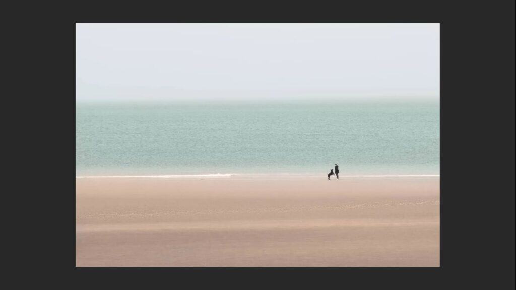
The Technique: Symmetrical Backgrounds as a Blank Canvas
One powerful and often overlooked method is to use a symmetrical background as a kind of canvas on which you can place other moving objects. So that would be a background where the left and right sides mirror each other, which will then create a perfectly balanced canvas.
Then you wait.
- Wait for movement in the scene.
- Wait for interaction in the scene.
- Wait for something to enter the frame.

That’s exactly what I did in the image featured here. I was observing a woman playing with her dog on the beach. I took a dozen photos as the scene evolved—but then one moment stood out. The subject aligned perfectly within the symmetrical frame, and that’s when I pressed the shutter.
Why This Works
- The symmetry creates stability in a composition.
- The moving subject provides contrast and dynamism.
This technique is repeatable and reliable, especially in places where movement is present, like:
- Parks
- Beaches
- City streets
- Train stations
- Festivals
Set yourself up with a strong symmetrical background, compose your frame, and then wait for people, animals, or objects to move into the right position.
Don’t Dismiss Symmetry
Symmetry is often overlooked simply because it doesn’t conform to popular compositional advice like the rule of thirds. But that’s no reason to ignore it.
- Symmetry and asymmetry are the two main types of composition. Almost all photos will be one or the other
- You don’t always need things to be off-center for a photo to be engaging.
- A well-composed symmetrical photo will still guide the viewer’s eye naturally and powerfully to the subject—without distraction.
In fact, if you browse through professionally taken images online, you’ll quickly see just how often symmetry is employed—even if you don’t notice it at first. Just take a closer look, and open your mind a little bit. They are there!
Symmetry works visually. And it always works visually.
Real-World Proof of Symmetry in Professional Photography
If you’re still unsure about how powerful symmetry can be, here’s something you can try for yourself: do a quick image search on the National Geographic website using the term “landscape photography.” What you’ll find might surprise you.

The Experiment: What I Found Scrolling Through National Geographic
All these photos featured on the National Geographic site are taken by:
- Professional photographers
- Talented amateurs
- Or at the very least, experienced enthusiasts
As I scrolled through the results, I began analyzing the use of symmetry in these images—and the results were striking.
Here’s what I noticed:
- Maybe 1 in 4 or 1 in 3 images use symmetry
- Symmetry is everywhere
What This Tells Us
- Symmetry is incredibly common in professional photography, even if the photographer isn’t consciously applying it.
- Many photographers are likely guided by an intuitive moment of inspiration rather than by rigid compositional rules.
- They take the shot because it feels right—and that feeling often results in a symmetrical composition.
They may not even realize it until reviewing the photo later. But it’s there.
I notice it all the time – and given that you made it this far, now you will too.
Why This Matters
Symmetry isn’t some niche technique or “hack.” It’s not ‘breaking the rules’ either. It’s a core technique used consistently by some of the best photographers in the world. It’s pleasing to the eye, repeatable, and effective.
So don’t overlook it. Start paying attention to how often it appears – and start using it intentionally in your own photography.
You’ll be amazed how often it works.
Try It Yourself – Symmetry in Your Own Work
So what about you?
Have you ever noticed how symmetrical compositions almost always work? If you’re skeptical, there’s only one way to find out: go out and try it yourself.
Here’s what I suggest:
- Head to your local park, beach, or even just at the end of your street. Just make it local..
- Look for symmetry—lines, reflections, balanced objects on either side of the frame.
- Frame your shot with symmetry in mind, and see how it feels when you press the shutter.
You might be surprised how often this simple technique results in a strong, compelling image.
And I’d love to hear about it.
Let me know in the comments below:
- Did symmetry improve your photos, or have a positive effect?
- Did it feel intuitive, mechanical, or somewhere in between?
- Or do you think there’s nothing to this idea?
Either way—whether it worked, or didn’t quite click for you—I’d love to hear your thoughts.
Here is the YouTube video that goes along with this article. They were made to complement each other, so you’ll get something valuable from each of them.
Enjoying the video?
Check out more on my YouTube channel — I post regularly about photography, composition tips, post processing, and general photography goodness.
Tap Into Your Intuitive Moment
If you’re curious about that intuitive moment I keep talking about – the thing that sits at the very heart of every great photo – then you need to check out this FREE video course right here (the moment of inspiration). Which consists of four videos that go through the whole picture making process.
The intuitive moment, or ‘Moment of Inspiration’ can be found in the first video. It walks you through how to recognize and act on that moment of inspiration, the moment that tells you:
“This is it. This is the moment. Take the shot.”
Anyway, apart from all of that… I hope something in this post inspired you to get out there, look more closely, compose more intentionally, and capture something great.