Introduction
Understanding the Rule of Thirds
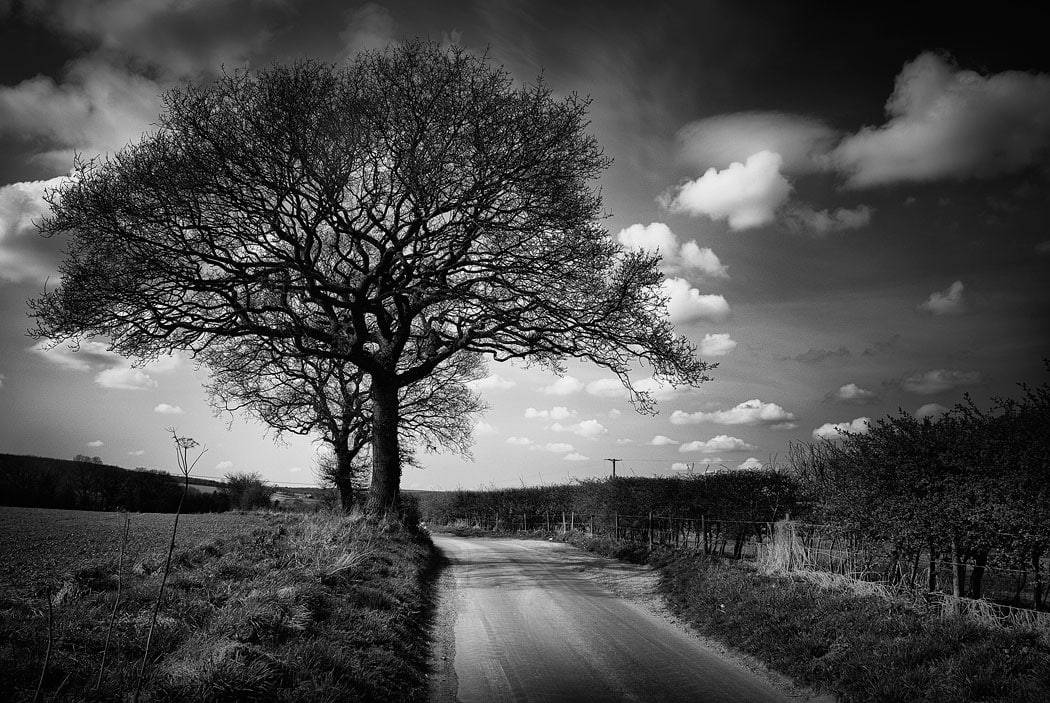
Everyone’s heard of the rule of thirds.
If you’ve ever taken a photography course, read a beginner’s guide, or spent any time online looking for composition tips, you’ve seen the rule of thirds mentioned – probably many, many times. I know… you’ve read the book and got the t-shirt!
So, in this blog post, I’m going to do things a bit different, and have a look at these three approaches:
- Show you how to use the rule of thirds ‘properly’, as a strict compositional rule.
- Demonstrate how to break it down and use it more loosely – as a helpful guideline rather than a fixed template.
- Guide you toward something more intuitive and personal – a way of composing photos that lets you step beyond the rule of thirds altogether, if you want to (or when you’re ready).
This isn’t about telling you the rule of thirds is bad or outdated, or it’s this or that. It’s about understanding what it does well, where it can fall short, and how you can develop your own eye.
Because ultimately, the most important thing is this:
You should be taking photos that you’re happy with.
Whether you stick rigidly to the rule of thirds, move beyond it, or bounce between different approaches – if you’re creating work you’re proud of, then you’re doing it right.
Anyway…by the end of this post, you’ll have:
- A clearer understanding of what the rule of thirds is really for
- A better sense of how to apply it (or not)
- The confidence to start thinking more intuitively about composition
About this Post
This blog post is adapted from a 12 minute YouTube video (linked at the bottom of the post)
If you prefer to watch rather than read, you can watch the video right now.
Although this blog post is written to compliment the video, so reading and watching will give you the full picture.
Table of Contents
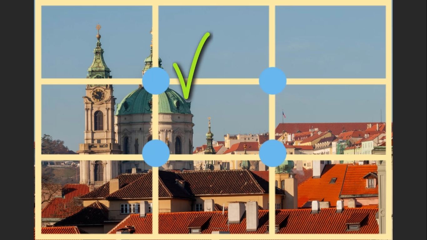
What Is the Rule of Thirds, Really?
Let’s quickly get something out of the way – what actually is the rule of thirds?
At its most basic, it’s a compositional grid:
- Two vertical lines
- Two horizontal lines
- Four intersection points
- It’s basically a set of guides for placing important elements
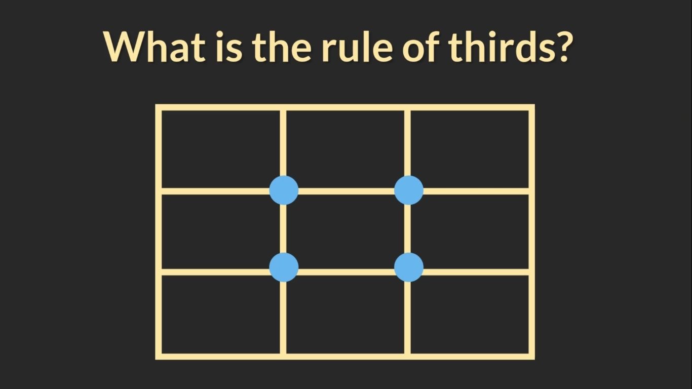
The logic is simple:
If you position the subject of your photo on one of those intersection points, and line up key elements like the horizon along the horizontal lines, the result is supposed to be more balanced and pleasing to the eye.
That’s the theory. And you’ve probably heard all of that a hundred times before.
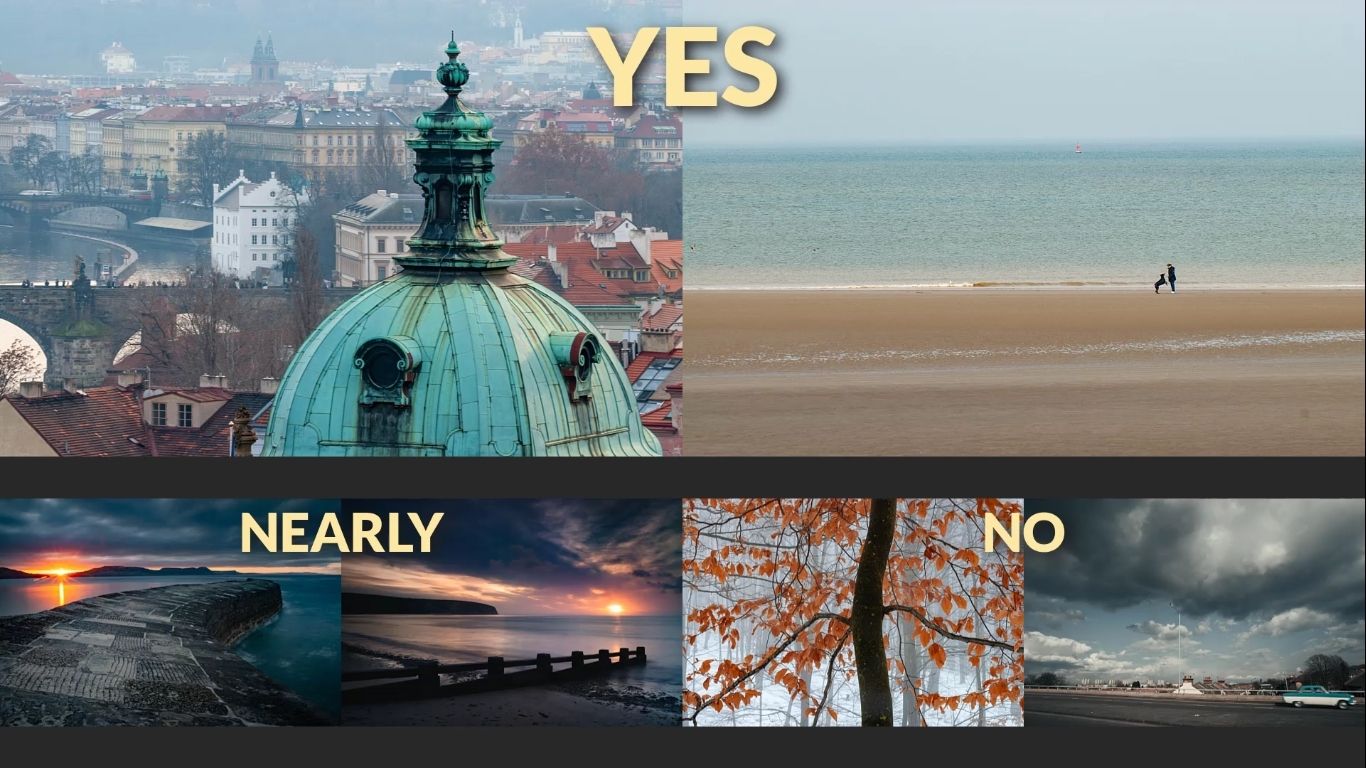
does it work…?
Yes, it can work. In fact, and if you look back over a bunch of photos, either your own or someone elses:
- Some of those photos will conform to the rule.
- Some will almost conform.
- Others won’t conform at all – but still look great.
But That’s Not the Whole Story
So what’s going on with those images?
The key thing is this:
None of the images above were deliberately composed using the rule of thirds.
And I know that because I took them
They were composed instinctively. I didn’t overlay a grid in my mind or consciously place things on intersection points.
And yet, some of them align with the rule – either partially or perfectly.
This is where the conversation starts to shift. Because while the rule of thirds can help, the truth is that correct composition (leading to good to great photographs) often comes from something more instinctive.
And we’ll explore that a bit later. But first…
Symmetry vs. Asymmetry in Composition
To really understand where the rule of thirds fits in, we need to take a step back for a second and talk about two fundamental principles of composition:
- Symmetry
- Asymmetry
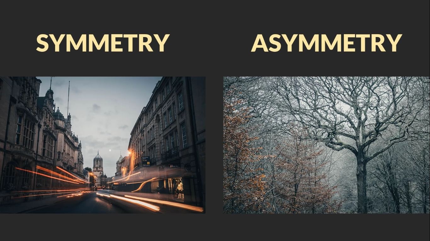
These are at the core of almost every photo – whether you’re conscious of them or not.
What Is Symmetry?
Symmetry is when the left side of your image is a mirror image of the right side.
Think of:
- Looking head on out to sea from a beach
- A building with perfect alignment
- A face photographed head-on
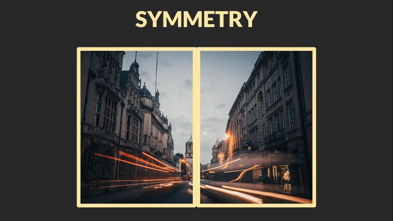
When you have true symmetry in your frame, it will always work compositionally.
- The composition tends to feel stable and pleasing by default.
- You don’t need the rule of thirds at all.
- The subject can be in the middle.
So if you’re dealing with symmetry, forget the rule of thirds. It’s not necessary. The balance is automatically built in. Go on,try it, I dare you!
Where the Rule of Thirds Does Come In: Asymmetry
But most scenes aren’t symmetrical.
And the other side of the coin is Asymmetry – and that’s where the rule of thirds can start to feel useful.
Asymmetry is when:
- The subject isn’t in the centre
- The background has unequal weight, where the left side is significantly different to the right.
- There’s visual imbalance that when composed right, still feels balanced.

In these cases, the rule of thirds provides a helpful tool. It gives you a way to restore balance.
But here’s the thing:
Asymmetry doesn’t require the rule of thirds – it just requites considered and thoughtful placement.
You can create stunning asymmetrical compositions without ever thinking about grids or guides. And that’s where instinct starts to take over.
And we’ll build on that idea next.
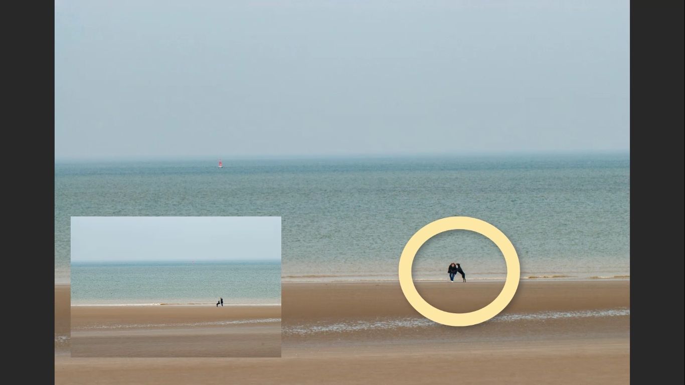
Practical Example: A Woman, a Dog, and the Beach
Let’s break all this theory down with a simple, real-world example – a woman on a beach, playing with her dog.
This kind of scene gives us a perfect setup to talk about:
- Symmetry in the background
- Asymmetry in the subject
- Direction of gaze and movement
- Subject definition
A symmetrical Background, an Asymmetric Subject
In this image:
- The background is symmetrical – it’s open, flat, and uncluttered.
- The subject (woman and dog) is clearly asymmetric – Placed according to the rule of thirds.
That contrast between symmetrical and asymmetrical matters.
Because the subject (woman and dog) isn’t symmetrical – the subject being the dog jumping up towards its owner , I chose to place them off-centre. She’s looking into the frame, and that decision is important. Why?
- It creates a sense of space in front of her.
- It stops the viewer’s eye from being pulled out towards the edge of the photo.
Tip: When your subject is a person (or animal), always pay attention to the direction they’re facing.
What Didn’t Work (And Why)
To show how placement affects the photo, I looked at two alternate versions of this image:
- The woman looking out of the frame
It’s okay but there feels like a lot of empty space to the left. And that big empty space becomes a little bit jarring. - The woman and dog merged together
This version loses clarity. When the two figures overlap too much, you lose definition. It’s harder to read what’s happening. And that’s a good tip for depicting any object in your photos.
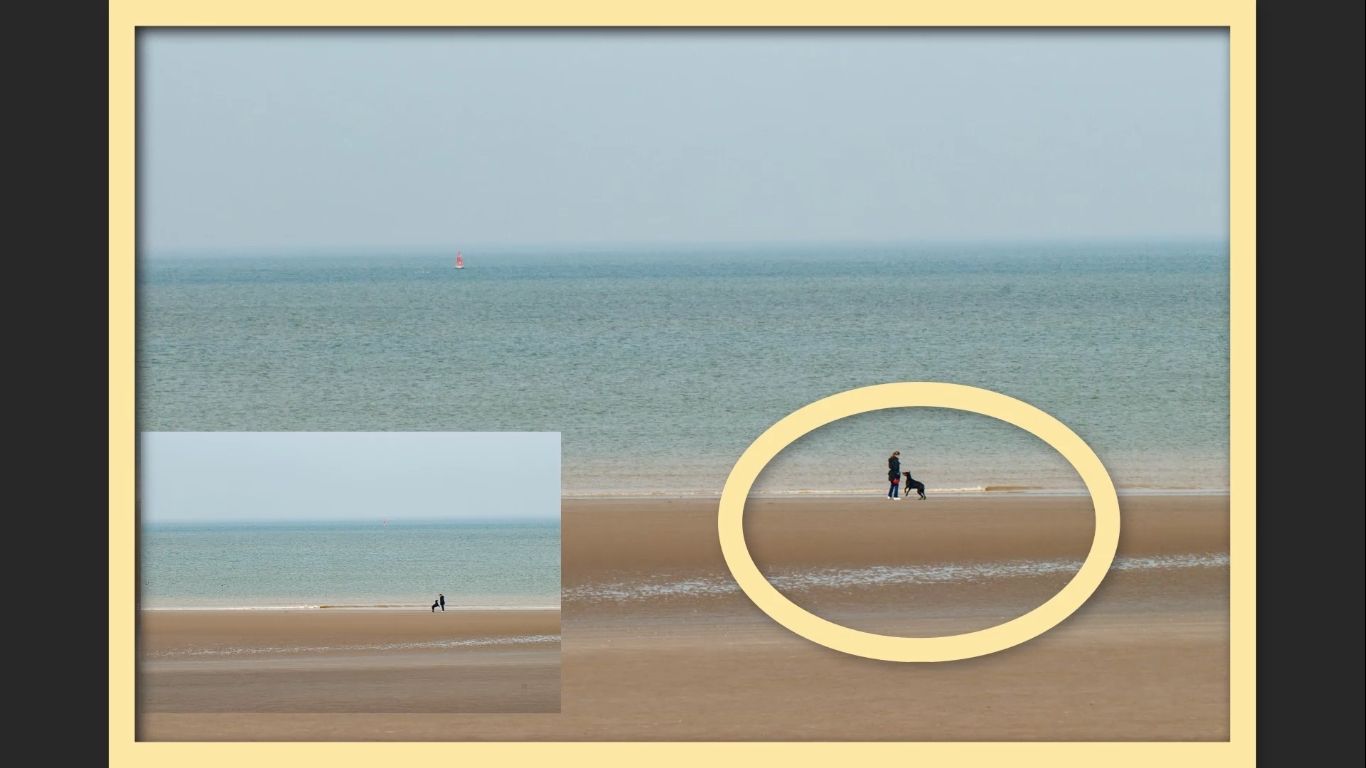
Why Subject Definition Matters
This brings up a critical point – regardless of your composition style:
Subjects (and indeed all objects) need to be clearly defined.
In this case:
- The woman and dog need to be instantly recognisable.
- Their shape is what helps tell the story.
- If that shape is messy or ambiguous, the photo loses impact.
This principle applies to any photo:
If your subject isn’t clear, the viewer won’t know where to look – or why they’re looking at all.
Practical Example: The Cyclist
Let’s take a look at another simple, real-life composition – this time featuring a woman on a bicycle.
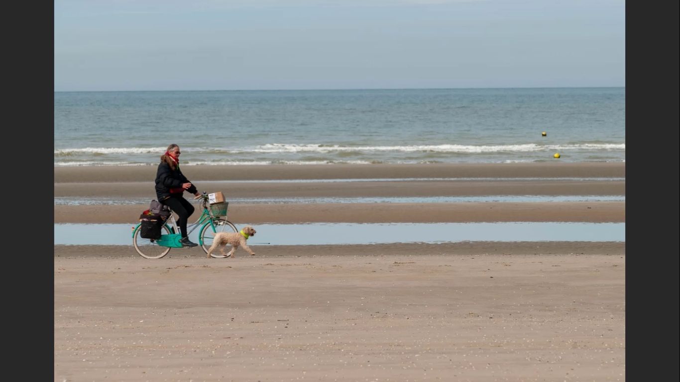
Once again, we’re dealing with:
- An asymmetrical subject (the cyclist)
- The rule of thirds at play
- Directional movement within the frame
Composing for Motion: Direction Matters
In the above version of the photo:
- The cyclist is placed on the left side of the frame.
- She’s moving into the empty space on the right.
This works well because:
- It creates space in the direction of motion.
- The composition feels open and natural.
- The viewer’s eye is led smoothly through the image.
Tip: When your subject is in motion, give them space to move into, not out of.
What Happens When You Get It Wrong
In this second version:
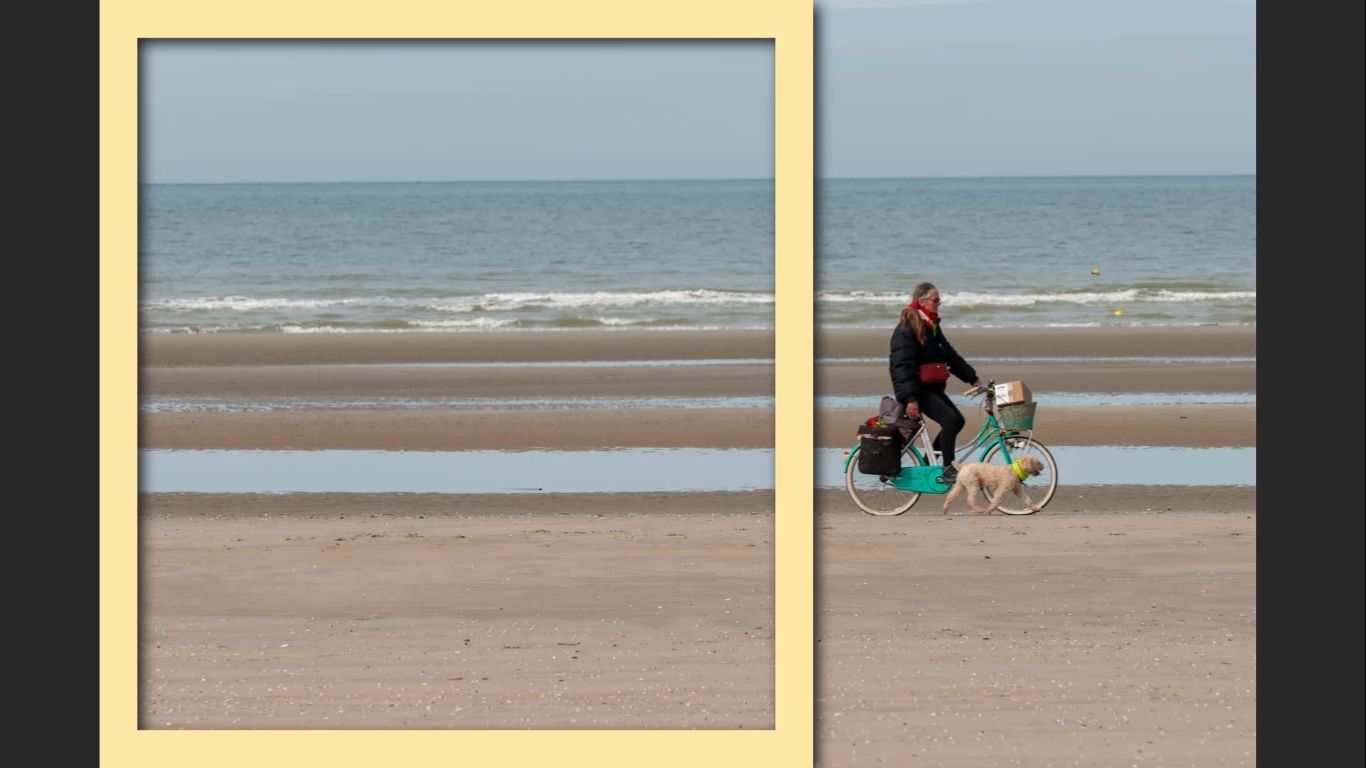
- The cyclist is on the right side, riding out of the frame.
- All the visual weight is crammed into one side.
What does that do?
- It introduces large areas of negative space that feel pointless.
- The whole image starts to feel a bit jarring, not as nice as the previous photo
Why the Rule of Thirds Helps Here
The best version of this image puts the cyclist off-centre, roughly along one of the vertical lines of the rule of thirds.
- The cyclist has room to move.
- The empty space in front becomes active and purposeful.
- There is still enough room behind the cyclist to make everything look like it was all meant to be there.
Well-used negative space can guide the viewer’s eye. Poorly-used negative space feels redundant and pointless
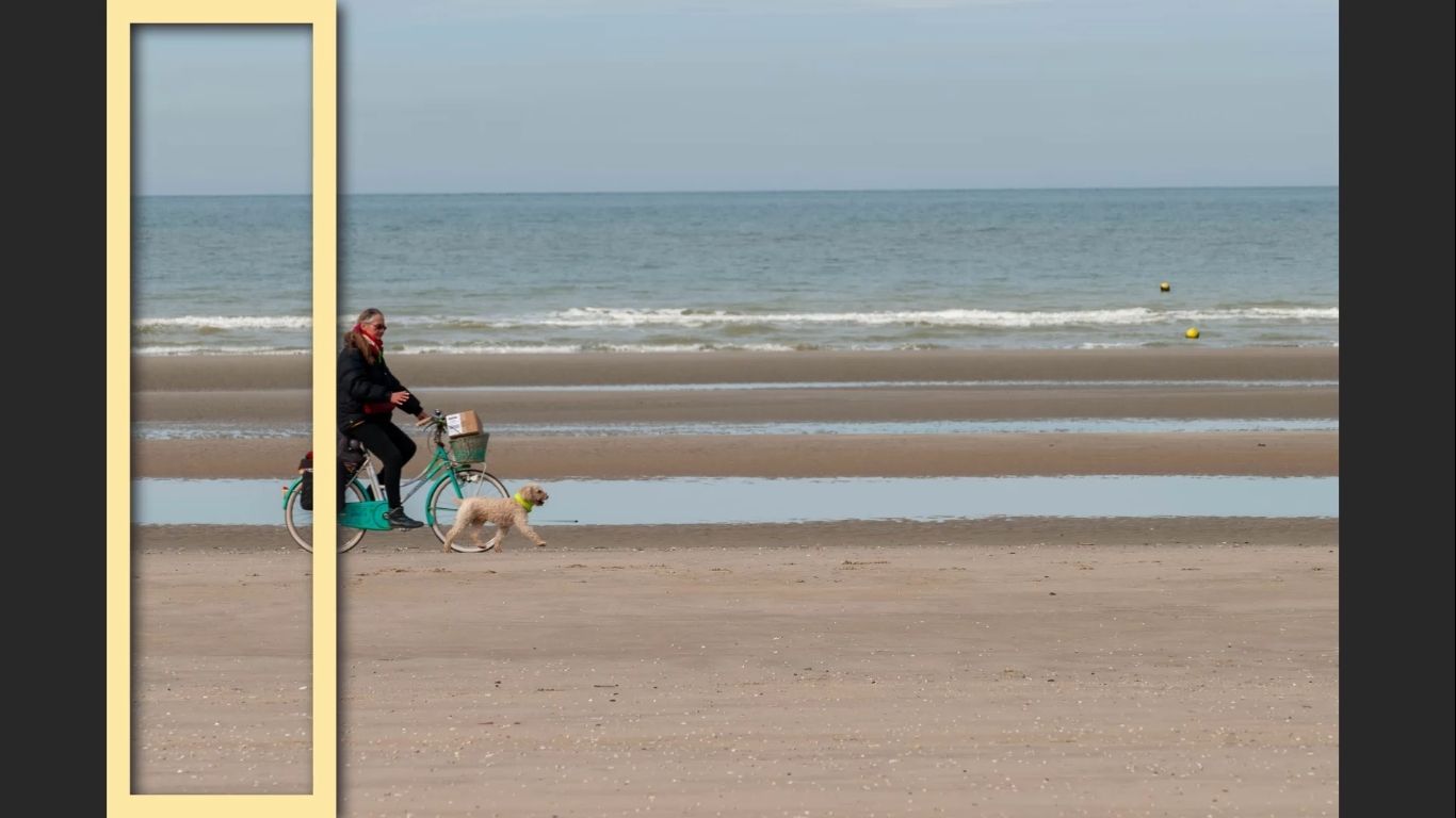
By applying the rule of thirds thoughtfully, we’ve not only improved the structure of the image – we’ve improved how it feels to look at.
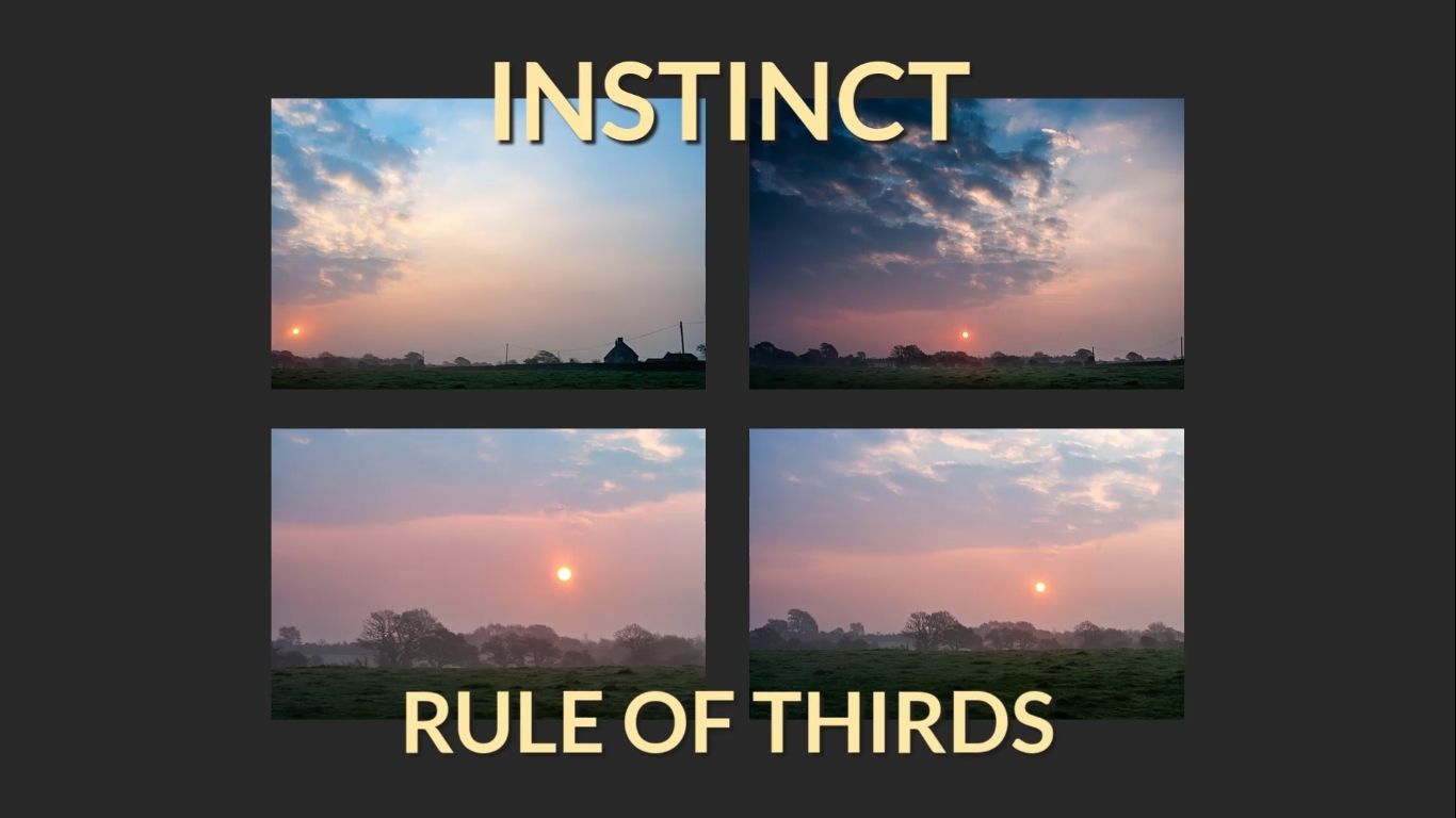
Advanced Comparison: Rule of Thirds vs. Creative Instinct
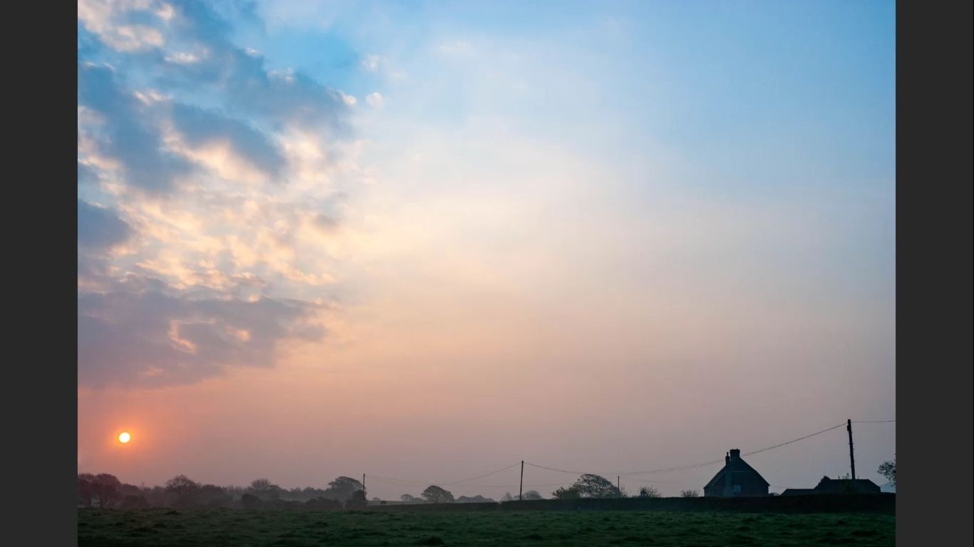
Let’s take things a bit further with a more advanced example. I’ve pulled together a series of images – all with very simple compositions but the outcome isn’t quite so simple.
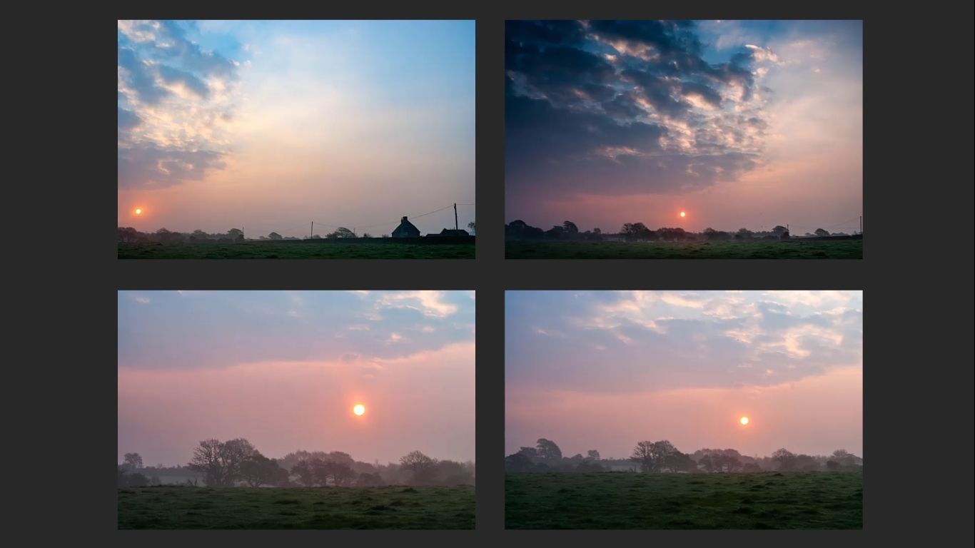
The Surprising Favourite
Out of all the images shown:
- My personal favourite is one that doesn’t clearly follow symmetry or asymmetry.
- It doesn’t lean on the rule of thirds either – but it just works.
- It feels instinctive, creative, and most of all – memorable.
Then there’s a second image I also really like. These two are what I’d call my keepers – photos I’d actually publish.
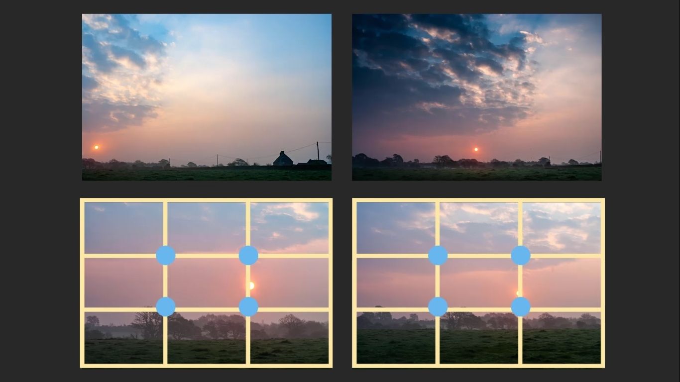
Interesting note: These two favourites don’t strictly follow the rule of thirds.
On the other hand:
When the Rule of Thirds Still Works
- Two other photos do follow the rule of thirds.
- They’re clean, balanced, and visually pleasing.
- Nothing about them jars or feels off.
These images definitely “work” – but for me, they just aren’t as visually compelling.
So what’s the difference?
Grids and templates vs. Inspiration
The key lies in the moment of inspiration. Being guided solely by that after having that intuitive moment
In the strongest photos my eye was drawn first to the sky, not the ground. Then to the sun in the sky – again, not the land. And that was guided by my moment of inspiration, and not influenced at all by a grid.
I only included enough of the ground to act as a stepping stone (You will see that in a lot of photos, and in film)
You could say that this is just one of those occasions where you have to break the rules. But if you are following the ‘rules’, is there then a ‘rule’ that says’ ‘now is the time to break the rule’. What I’m trying to say is, how do you know when to break the rules?
If you stick to the ‘moment of inspiration’, that will tell you all you need to know.
Let Intuition Lead the Way
All this proves an important point:
The rule of thirds can help – but instinct and feeling can take you further.
On the surface, the ‘Rule of Thirds’ feels like something solid and tangible, whereas intuition and feeling feels wishy washy and flaky. So I understand the reluctance of people to believe any of this stuff.
In the above example:
- The rule of thirds did produce solid, balanced images.
- But my instinct produced something more emotionally engaging.
This is why I believe your intuition and moment of inspiration should lead the way. The rule of thirds is an interesting tool – but on its own it will never produce the very best results consistently (only very rarely)
Viewer Engagement: What Would You Have Done?
At the end of the day, the most important rule in photography is this:
Take photos for yourself first, and everyone else second.
That means the final decision always lies with you – the photographer behind the lens.
It’s Your Call
In the above example with the four images, there were two images that I felt were the strongest compositions based on how my instinct and the moment of inspiration reacted in the moment. But what do you think?
Here are a few questions to consider:
- Would you have chosen the same two images as your favourites?
- Do you think the rule of thirds helped – or got in the way?
- Would you have framed the scene differently?
Share Your Thoughts
I genuinely want to know what you think. Leave your thoughts in the comments – whether you agree, disagree, or have a completely different take.
Your point of view and experiences helps fuel the conversation, and it’s always great to hear how other photographers see the same scene.
Practical Example: Reflection and Cobblestone
In this example, the photo centres around a reflection – and that reflection is the subject.
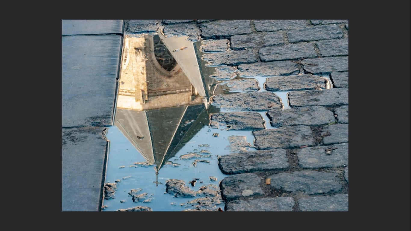
Why us the reflection the subject? Because that’s where I want the viewer’s eye to go when they look at the image.
Breaking Down the Scene
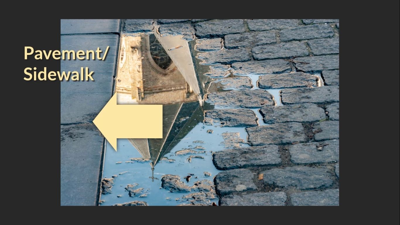
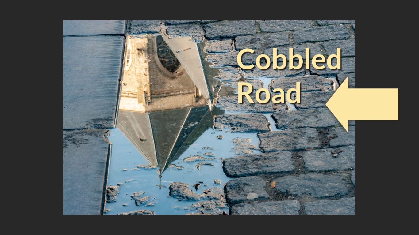
The left side of the image shows a pavement (or “sidewalk,” depending on where you’re from). The right side contains a cobbled road, with the puddle and reflection positioned in the centre.
This gives us a classic example of asymmetry. Neither side is a mirror image of the other, and that creates visual interest. But more importantly, it opens the door for the rule of thirds to play a useful role.
Choosing the Stronger Side
When faced with an asymmetrical scene like this, ask yourself:
- Which side has more visual interest?
- Which side supports the subject better?
In this case, I felt the cobbled road was stronger than the pavement. So I gave it more space in the frame.
Applying the Rule of Thirds
Once you’ve worked out the dominant side:
- Place more of the visually interesting side (in this case, the cobbled road) in the frame.
- Use the vertical line from the rule of thirds to place the join – the line where the pavement meets the cobblestones.
That alignment naturally balances the image thanks to the background’s asymmetry.
The rule of thirds tends to work best when the background is asymmetrical, and then the subject can be placed at the intersection of those two sections, along one of the vertical lines in the rule of thirds grids.
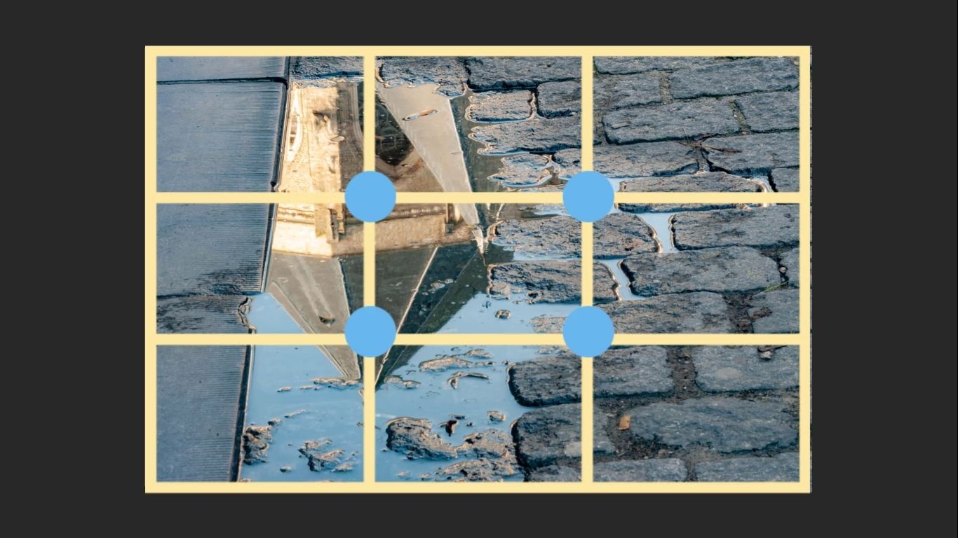
In short, if you can identify asymmetry, you’re more likely to make the rule of thirds work in your favour.
Practical Example: Underpass and Graffiti
This scene features an underpass, and the moment that caught my eye was a woman standing next to a graffiti-covered wall. That combination alone created asymmetry, which gave me an opportunity to make a strong composition.
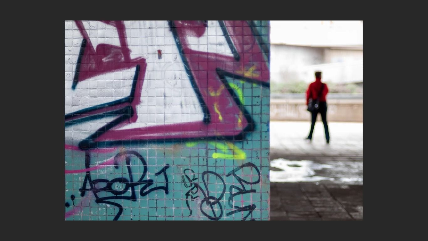
Noticing Asymmetry in the Scene
- The subject (the woman) stands out, in her own space, against the texture of the graffiti.
- The left side of the frame contains the graffiti wall and underpass structure.
- The right side contains open space, where the woman is placed.
That imbalance between the two sides is what makes the scene visually interesting – and it’s where the rule of thirds can come into play.
How I Composed It
- the edge of the graffiti wall is placed on a vertical third line.
- The woman was placed on the right side, occupying the space to the right.
- This created a balance between asymmetry in background and symmetry in the positioning of the woman.
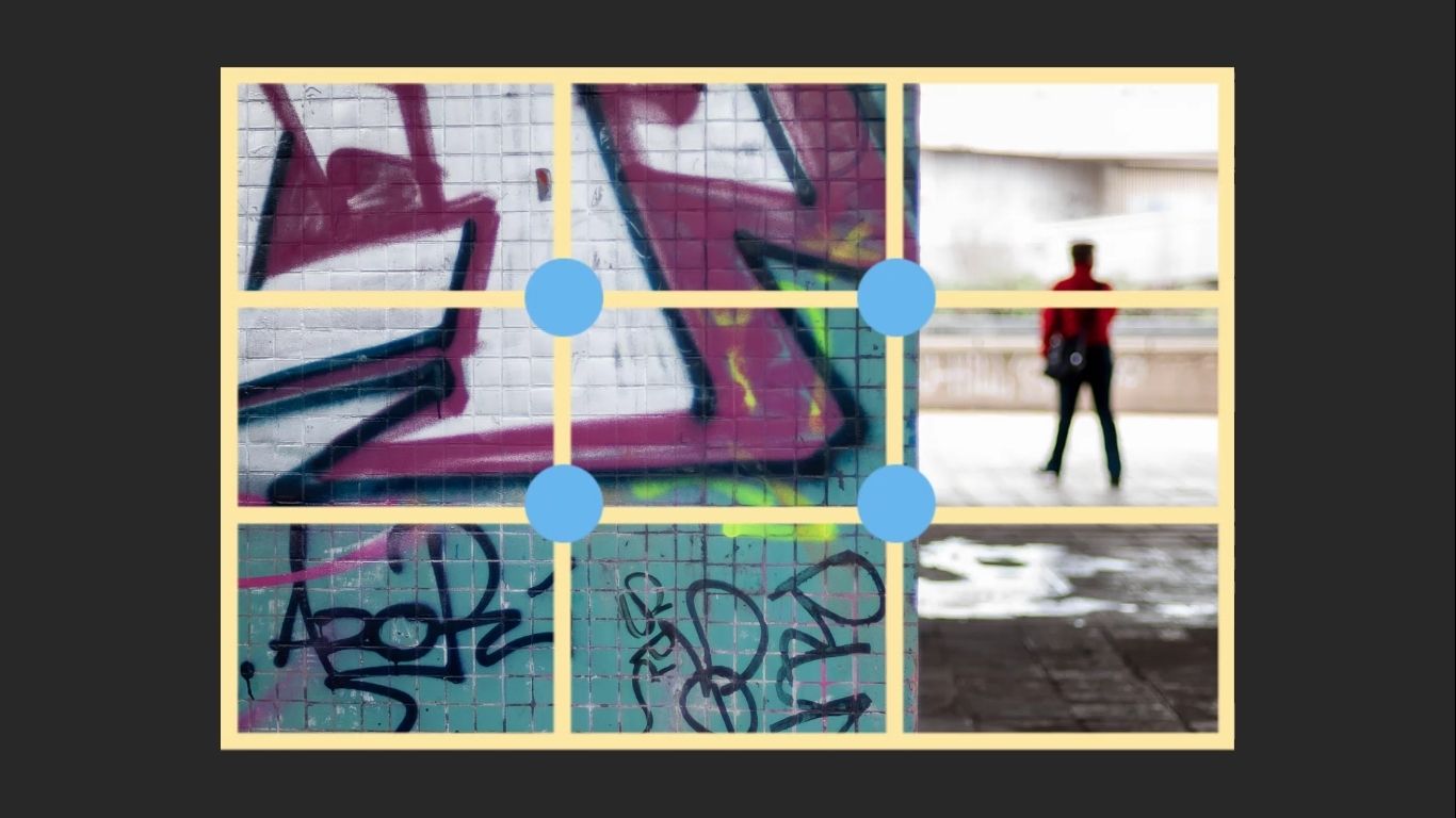
A Bit of Rule of Thirds, A Bit of Instinct
This shot is a nice blend:
- The rule of thirds guided the placement of the elements.
- But there’s also creative freedom – trusting my instinct to balance the symmetry and asymmetry in a way that looked visually strong.
Final Thought
This example is a reminder that while the rule of thirds is helpful, it’s even more effective when you:
- Recognize asymmetry in a scene, rather than forcing asymmetry into a composition.
- Think creatively about how to use asymmetry.
- Combine the rule of thirds grid with your own intuition
When you do that, you often end up with something much more visually appealing than simply applying a template (rule of thirds) without really thinking intuitively.
Architectural Example: Church Rooftops
In this example, I’m working with a wider architectural scene, and the subject is a church. The standout feature was a sweep of rooftops on the right-hand side of the church that immediately caught my eye. Obviously the church dome caught my eye too! Bit compositionally the surrounding areas combined to create the ‘moment of inspiration’.
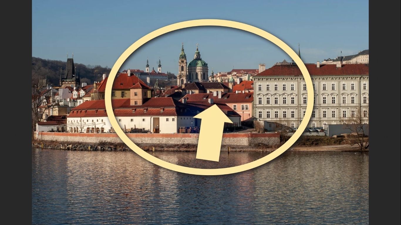
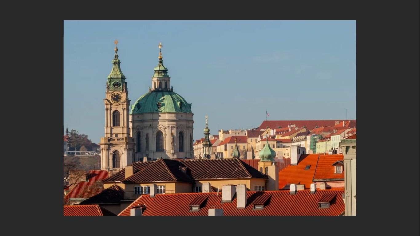
What I Saw
- A series of angled rooftops creating a sweep on the right.
- No equivalent feature on the left, making the scene asymmetrical.
- The church itself, with a prominent dome and steeple, acting as the subject.
How I Composed the Image
Instead of placing the church dead centre, I used an off-centred composition to take advantage of the more interesting scene to the right-hand side:
- Removed the left-hand side of the frame, which lacked visual interest.
- Included the rooftops on the right, which were part of my initial moment of inspiration.
- Placed the church dome on or near a rule of thirds intersection point.
This not only emphasized the most visually interesting elements but created a sense of balance using asymmetry.
Using the Rule of Thirds Without Forcing It
- The rule of thirds wasn’t strictly employed here – but the idea of placing the subject off-centre guided the shot.
- That choice came from intuition first, and then reinforced by composition principles.
Why It Works
- The church dome and steeple provides a focal point for the viewer’s eye to go straight to and lock on to immediately
- The blue sky creates a clean, uncluttered background, helping the dome and steeple to stand out.
Framing Example: Couple in Archway
This photo combines architectural elements with human interest. The subject is a couple framed inside an archway, and the image came together through a mix of creative instinct and compositional ‘rules’.
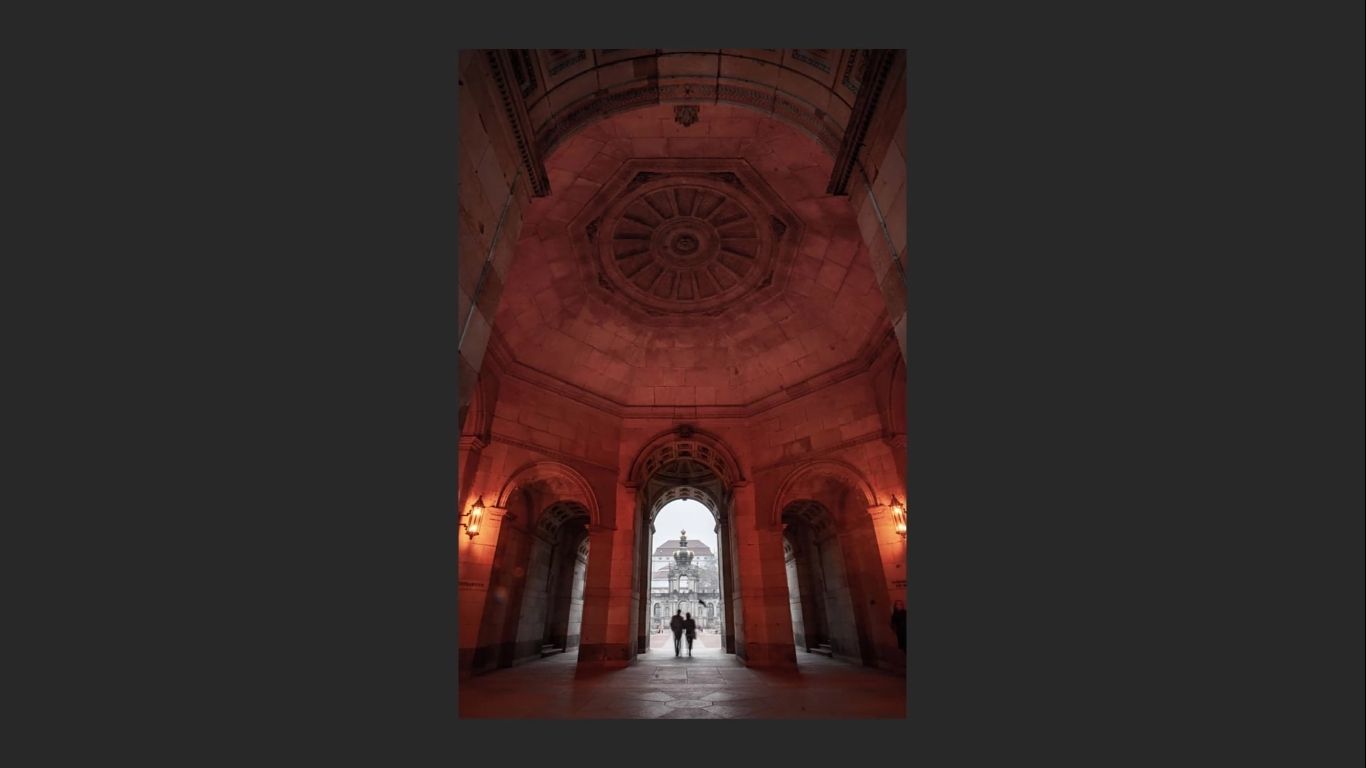
Framing combining Intuition and deliberate choices.
The decision to use a wide-angle lens came from instinct. I needed to include:
- The dome above the couple.
- The arch at the top of the frame, which naturally framed the whole composition.
This created a strong visual boundary that draws the eye in and centres attention on the couple. This was very striking at the time and screamed out to me intuitively.
What About the Floor Space?
One of the challenges in this shot was the empty floor area in the foreground. It wasn’t adding any extra ‘value’, so I made a conscious decision:
- Not to give it too much space in the frame.
- Keep it well below one-third of the image height.
- Use it only as a stepping stone to guide the eye toward the actual subject.
So again, making use of that ‘stepping stone’, a common compositional device in my photography.
Rule of Thirds Used Loosely
This is where the rule of thirds worked as a soft guideline rather than a strict formula. the only way to put is that I was aware of the existence of the ryle of thirds in this photo – as I took it – but was still working instinctively, doing what felt right.
- I off-centred the couple within the frame (vertically).
- Avoided letting the composition become too rigid (aware of rule of thirds, but not dictated by it).
- Allowed intuition and creativity to do the heavy lifting.
Why This Works
- The archway naturally frames the couple, directing the eye.
- Minimal floor space avoids wasting visual ‘real estate’.
- The wide-angle lens adds a sense of grandeur and context.
This is a good example of how rule of thirds can support – not override – intuition. I followed the template just enough to give balance, but let instinct shape the overall feel.
Breaking the Rule: Fly-Over & Classic Car
Not every photo follows the rules. In this case, I ‘broke’ the rule of thirds – and it still worked.
A Shot That Shouldn’t Work, according to the ‘rules’ (But Does)
This image was taken from a fly-over. What caught my eye initially was:
- The dramatic cloud cover overhead
- The rooftops opposite the road
- A classic car zipping past at the very bottom of the frame
That car ended up right on the edge of the image, nearly leaving the frame entirely. By all the conventional rules, it’s a compositional mistake. But in this case, it helped to create a compelling photograph
Why This Image Works
Even though the rule of thirds didn’t apply here, the photo still came together because of:
- Strong instinct and timing – that moment of inspiration. And trusting it.
- A bit of luck – I didn’t press the shutter fast enough to catch the car more centrally, but the result felt right anyway
- Visual tension – the car exiting the frame so close to the edge of the frame adds a dynamic quality, not least because of those rooftops that catch your attention
This is a clear example of how intuition can and should override arbitrary rules , especially when you start to trust your instincts.
Advice for Beginners
For those still learning:
- Start by looking for asymmetry in your frame
- Use the rule of thirds as a reliable starting point (if you must)
- Over time, begin to push the boundaries of those guidelines,and let instinct take over.
Try this mental trick: imagine the intersections of the rule of thirds grid as larger zones, giving you more freedom to shift your subject around without drifting too far from your gut feelings.
Final Thought
This photo worked because it felt right, not because it was mathematically perfect. That’s something you’ll grow into as you shoot more, and trust your instincts.
Why the Rule of Thirds Works
The rule of thirds isn’t magic – it’s a tool. But it’s a tool that can help you – especially when you’re starting out – to create cleaner, more balanced images that feel good to look at. It will act as a starting point to help you think about composing your shot. But it will only take you one stepping stone on from where you are at the moment (assuming you are either a beginner or are struggling). The rule of thirds is limited, and limiting. Don’t forget that
What’s Really Going On?
The rule of thirds helps by guiding your placement of important elements like subjects, horizons, and points of interest. It helps you keep objects separated from each other, and away from being too close to the edge of the frame.
- Encourages space around the subject, avoiding the common mistake of positioning things too close to the edge of the frame
- Makes your subject instantly visible without distraction (in theory)
- Helps direct the eye into the frame, rather than drifting out
but it does it in a very one dimensional way. A kind of entry level kind of a way. There are more comprehensive ways of doing this that is equally as simple and easy to use as the rule of Thirds.
It Helps You Make Compositional Decisions
By dividing your frame into thirds (both horizontally and vertically), the rule:
- Prompts you to ask: Which side of the photo is more interesting?
- Helps you place more of the sky or ground, depending on where the interest lies
- Encourages you to commit to a decision, which is very useful at the start of someone’s photography adventure.
But don’t let it straightjacket you.
Not everything you want off-centre will land perfectly on a grid line or intersection. And that’s okay.
You need to:
- Stay flexible
- Be guided by your moment of inspiration
- Trust your intuitive sense of balance and subject placement
Final Thoughts
The rule of thirds is arbitrary, yes – but its simplicity for a beginner is a great starting point for learning the art and the craft. . It’ll serve you well in many situations, and even more loosely in many others. As you’ve seen from the examples:
- It works best when combined with instinct
- You can (and should) seek to go beyond its restrictions once you’ve practiced enough
And don’t forget that mistakes are essential for learning – mistakes will help to sharpen your eye more than anything else!l
So be flexible. Shoot lots. Experiment. Make mistakes. That’s the very best way to unlock your very best photographs.
What Do You Think?
The rule of thirds can divide opinion in photography circles. Some photographers treat it as gospel, while others – like me – see it as a useful but overrated guide, not a law. I’ve shown you examples where it appears to work, and others where ignoring it led to something stronger, more original, and more emotionally in tune with the scene.
So now it’s over to you.
Do you find the rule of thirds helpful in your own photography? Have you had moments where breaking it led to better results? And what does ‘breaking the rules’ even mean?
Or do you still believe it’s the best foundation for every composition?
Let me know in the comments. Whether you agree or disagree, I’d genuinely like to hear how you see it. This is where real learning happens – by sharing ideas and pushing each other to think differently.
Here is the YouTube video that compliments this article.
Enjoying the video?
Check out more on my YouTube channel — I post regularly about photography, composition tips, post processing, and general photography goodness.